“Aww! That design looks dreamy and feminine, especially the font used on its text!”
“That simply looks magical!”
Do you want to receive the same reactions from anyone looking at your design? Well, of course, the deciding factor for this is how well you group and layer the design elements.
But, if you’re creating a logo for a feminine brand, or designing wedding invitations, you need to add elegant details to the design.
The font style you use — especially the cursive style — elevates the vibe to a classic, elegant, and feminine one.
So, if you’re a budding graphic designer confused with what cursive font to use, look at some incredible suggestions here.
The Best Cursive Fonts on Canva
- Yellowtail
- Marck Script
- Lobster/Lobster Two
- Playlist Script
- Amsterdam Three
- Badger Script
- Madelyn
- Jonathan
- Great Vibes
- Magenta
- Engagement
- Daydream
12 Best Cursive Fonts on Canva: The Reveal
Dreamy. Elegant. Classic. Timeless. Feminine.
These are some of the adjectives people describe whenever they’re asked about using cursive fonts on their Canva designs.
Though some find it a bit hard to read, cursive fonts have great use if you’re planning for medieval, princessy, or dreamy events like debuts or weddings.
Plus, cursive fonts closely resemble a person’s handwriting. So, it’s like adding a personal touch to your design, except that it’s done digitally.
So, let’s learn about the best cursive fonts you can find on Canva.
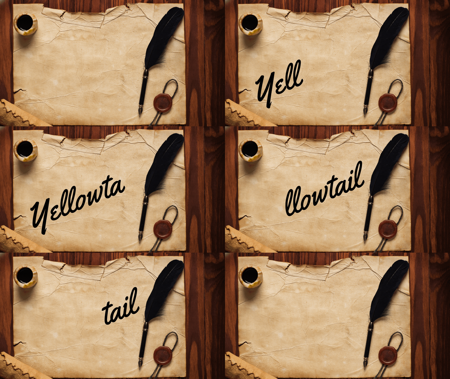
1. Yellowtail

If you want to use a cursive font that gives off a subtle hint of retro but still modern-looking, then Yellowtail’s the best one you can use. Of course, if you’re talking about readability, it won’t make the cut if it’s not legible.
What makes it unique is that this font features both non-connecting and connecting letters, making it legible.
It may be a bit old-school, but it surely scores in both the charm and readability department.
2. Marck Script

Second, on the list of best cursive fonts on Canva is the Marck Script. You’d probably think this font style’s named after a Marck.
In reality, Marck Script’s indeed named after the person who created this freehand lettering style with a felt-tip pen in the person of Marck Fogel.
You’d probably think this font shouldn’t make the cursive list as the letters aren’t connected. However, this lack of connections is what makes it part of the best due to its readability.
Think of it like you’re practicing how to write letters in cursive individually.
Regardless of what you think, Marck Script offers a certain air of elegance that’s perfect for the dreamy types of designs — wedding invitations, princess-themed birthday party invites, or even digital love letters (if there’s even such a kind).
3. Lobster/Lobster Two

Now, if you’re raring to use a newer, casual font style but still emitting that retro vibe, then the Lobster and Lobster Two fonts are the ones you should try out.
Created in 2010 by Pablo Impallari, Lobster became popular with more and more websites, logos, packaging, and ads using it.
It’s understandable as the designer used a couple of ligatures (links in simpler terms) to create that neat look with a punch of personality.
But, with its popularity, people start dubbing it as the new Comic Sans, which is a casual type of sans serif font created by Vincent Connare in 1994.

Meanwhile, the Lobster Two font is an improved version of its predecessor. If you noticed, the original Lobster font’s got a thick weight to it.
With Lobster Two, you’ll notice similar strokes but has lighter weight.
So, depending on what you’re leaning into, both Lobster and Lobster Two are great font styles to use in emitting the casual retro vibe onto your brand.
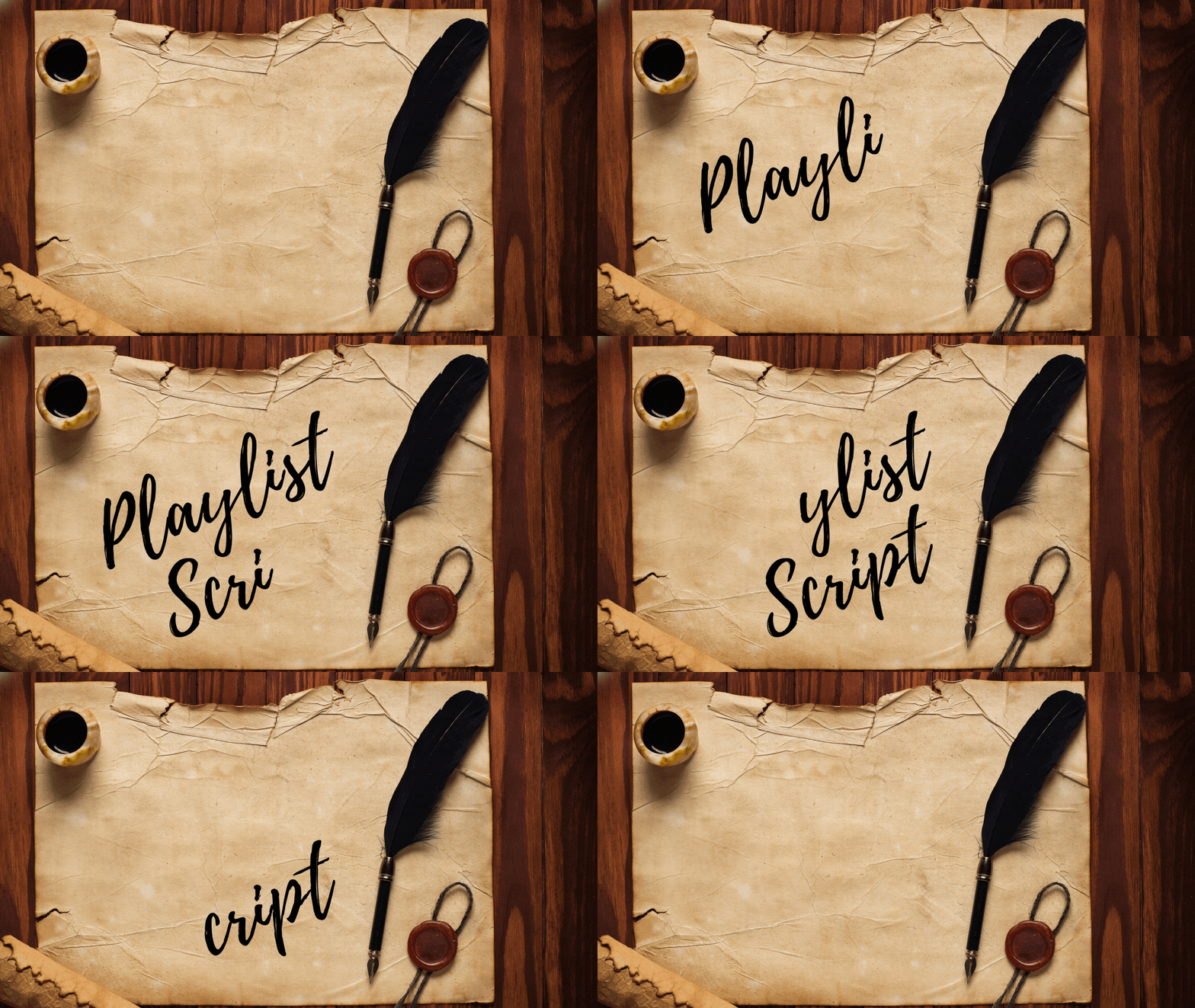
4. Playlist Script

Now, if you’re tired of the pen-like strokes for your cursive letters, why not give Playlist Script a try?
From the name itself, this font style gives off an effortless vibe but still exuding elegance. Think of it like you’re using a calligraphy brush and swishing it on paper with relaxed strokes.
So, if you’re designing for a brand that’s casual in nature, then feel free to use this font.
From t-shirt designs to fun and playful wedding invitations, quotes, and greeting cards, Playlist Script won’t let you down.
5. Amsterdam Three

For a more personal touch but not taking out the fun into your text, Amsterdam Three’s the right font style you can use.
I personally love this font style! Not only is it retro-looking, it sort of gives off a 90s handwriting vibe.
It’s like while you’re staring at it, you feel like writing with a pen and paper using the same strokes!
Though it’s a good font to use for doing designs with quotes and logos, this font can sometimes be hard to read.
So, as much as it’s endearing, you shouldn’t overuse this font style (if there’s such a term).
Other good uses for Amsterdam Three font style include:
- Signatures
- Album covers
- Photo watermarks
- Business cards
But, for you to use this font style, you need to have a Canva Pro account.
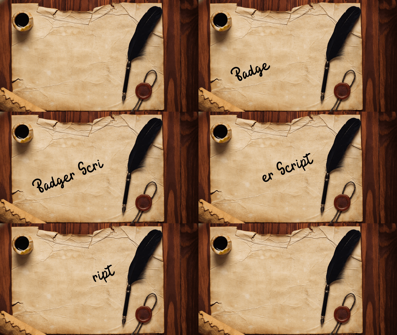
6. Badger Script

If you don’t want to give off a too sophisticated vibe on your design, Badger Script’s got you covered on this.
With more rounded cursive strokes, Badger Script’s one of the go-to font styles used to create invitations.
It also gives off a relaxed vibe to it, allowing you to read the text without straining your eyes.
But, just like the Amsterdam Three font, you need to be on Canva Pro to use this.
7. Madelyn

Another signature style font that you can use for quotes, wedding invites, and social media posts is Madelyn.
Aside from its readability, Madelyn gives off a feminine vibe to the words you type.
The more you look at it, the more it looks like real handwriting on paper. It’s such a friendly and organic font style that allows you to portray style and individuality in your text.
With that said, it’s safe to say that Madelyn’s a good choice for all kinds of designs.
And, just like the other two mentioned earlier, this font’s available only to Canva Pro users.
8. Jonathan

Another cursive font that looks like a signature of an aristocrat is the Jonathan font.
Though it’s quite hard to read, especially if you’re using small font sizes, Jonathan allows you to have a more casual vibe to the text.
Yet, it’s one of the most popular font styles used by Canva users for their designs.
Since it’s made to look like a person’s signature, you can expect unexpected, slopes, loops, and curves to the overall text.
Think of it like you’re in a hurry to jot down something while making sure that your notes are still readable.
9. Great Vibes

To add some element of grandeur and royalty to your brand’s logo, you can use Great Vibes font.
The first time I saw the font style, I can’t help but feel attracted to how free-flowing Great Vibes is. It’s like you’re reading some Victorian-era letter from the upper echelon of society.
Even if you use this font in smaller sizes, it’s still legible.
10. Magenta

Are you planning on creating a notebook-style design wherein the text looks like some form of lazy doodle on the paper?
Well, you’re in the right place, as Magenta’s cheery vibe is the best fit for your casual designs.
Unlike the other font styles mentioned earlier, Magenta can’t compare to their elegance. But, mind you, you can’t help but smile while looking at the text “written” in this font.
This youthful font style’s the perfect fit for birthday greeting cards and wedding invitations.
But, Canva Pro users have a greater advantage here as this is a Premium font style.
11. Engagement

If you don’t like going too casual or elegant on your logo’s text, then Engagement is the perfect match for what you have in mind.
With the soft contours this font style offers, you’ll definitely find yourself staring at text that looks both vintage and modern.
Having said that, it’s a great font style for subheadings on girly or romance novels. But, mind you, you can always experiment and use this when creating greeting cards.
12. Daydream

Now, who wants to see a font style that allows you to think you’re reading some journal of some sort? If you’re up to that, then start using Daydream as your next cursive font style.
With such a beautiful and charming font, this is another perfect font you can use for brand logos that want to be stylish at the same time elegant.
Also, like the Magenta font, Daydream’s also exuding a feminine vibe to it. It’s like the moment you read text “written” in this font, you’re sure that a girl did it.
Plus, if you’re into brush calligraphy, Daydream’s one of the best font styles to add to your arsenal.
I wouldn’t be surprised if a lot of people would soon order some wedding invites written in this font style.