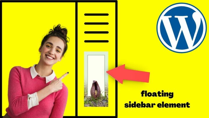

The sidebar on WordPress sites is prominent at the top fold of your website.
With more content becoming long-form, the prime real estate on websites isn’t at the top. It’s far further down the page.
To really increase your metrics, be that monetary, email opt-ins, click-throughs on affiliate offers, or any goal you have, WordPress floating (or sticky) sidebars keep your prime real estate on the screen.
Provided it’s on desktop, tablet or PC, that is.
Thankfully, adding a floating sidebar to your WordPress site is dead simple. All you need to do so is one simple WordPress plugin.
Read on to found out which one that is!
How to get a floating sidebar on your WordPress website?
Installing the Free “Q2W3 Fixed Widget” adds floating sidebar functionality to most WP themes with left, right or double sidebars. The setup is extremely simple and your sticky sidebars are set up within minutes, be it on desktop or even mobile devices.
Installing, Activating and Setting Up the Q2W3 Fixed Sidebar Plugin
Click “Plugins”, and type “Q2W3” (without quotes) into the search bar on the top right of your screen, then hit enter.
The first result is usually the right one.
Q2W3 Fixed Widget for WordPress by Thomas Maier, and Max Bond.
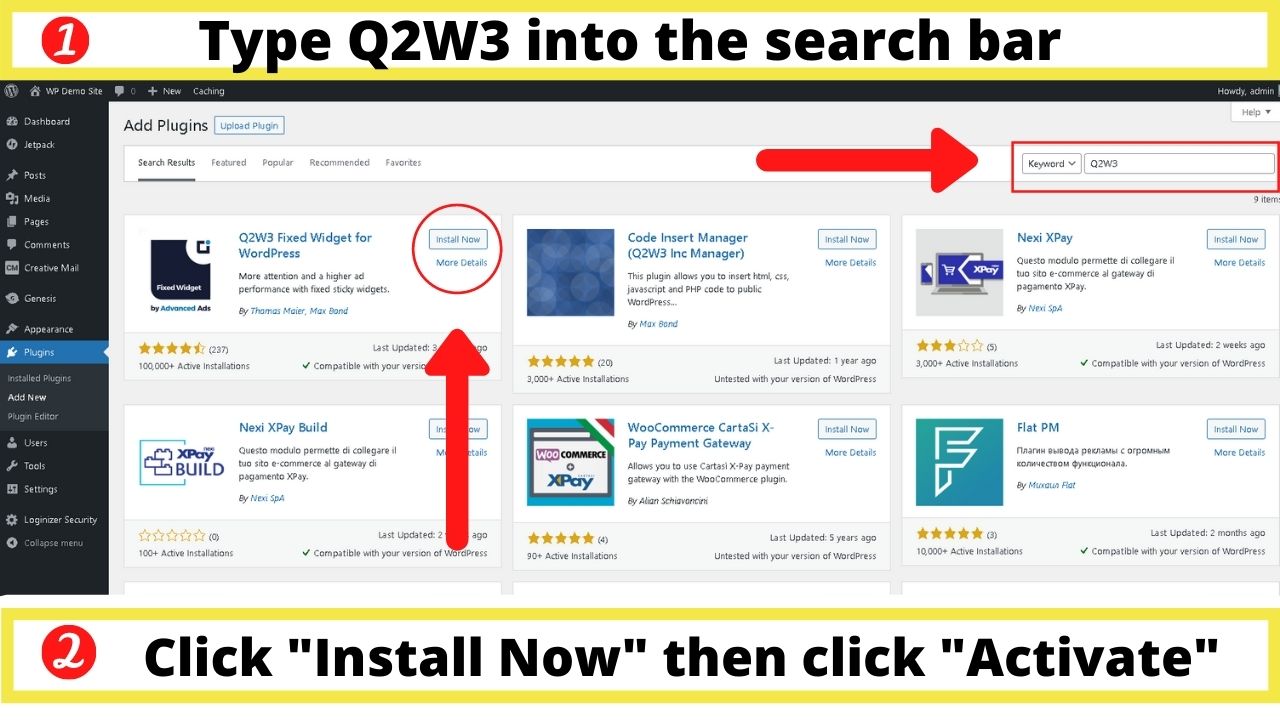

Press “Install Now”, then click “Activate”.
It’ll appear on your active plugins page. If you don’t get redirected to that page automatically, click the plugins link on the left navigation bar.
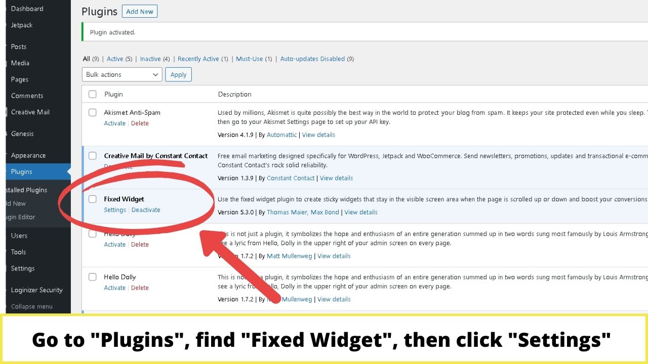
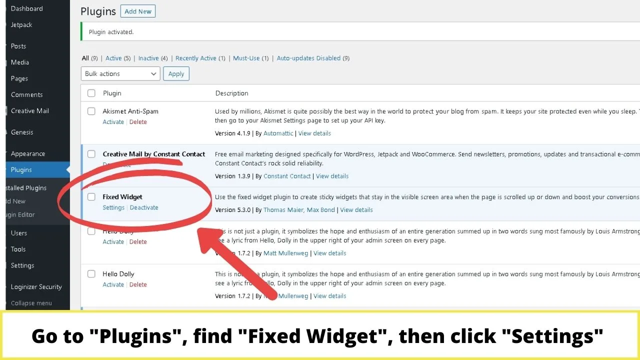
Click on Settings.
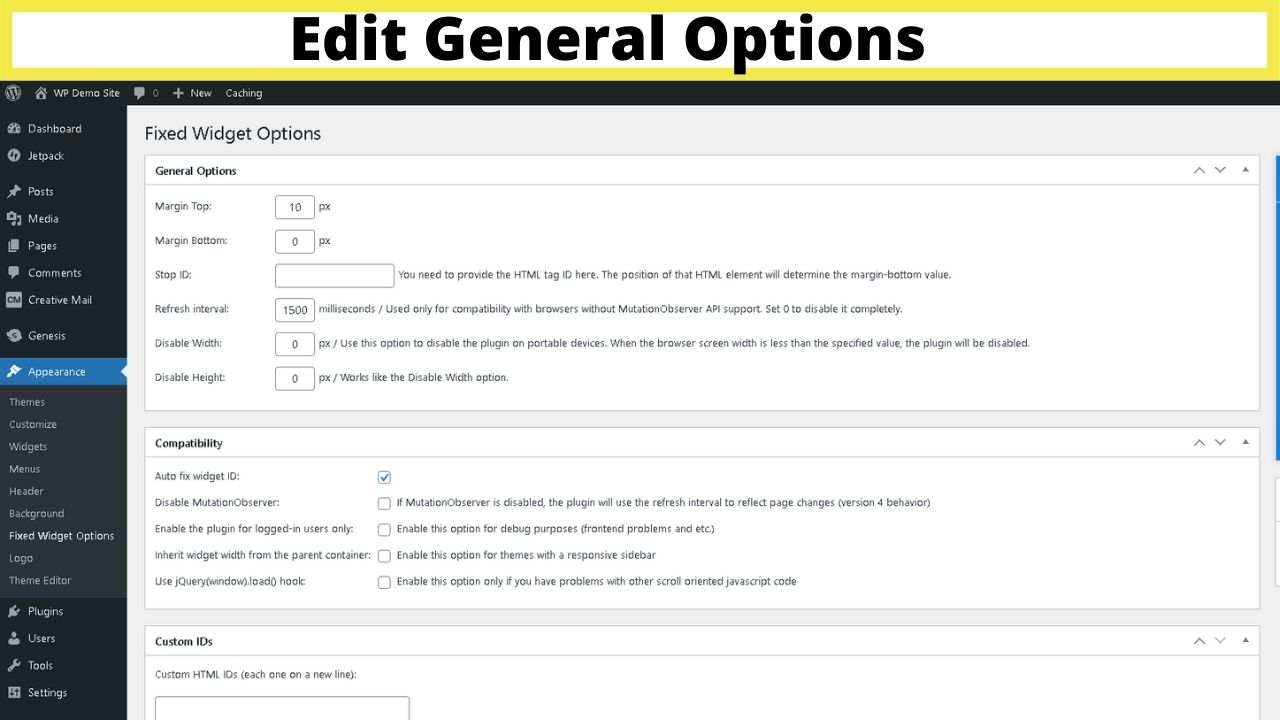
These are global settings meaning they affect every floating widget in your sidebar. You can’t set these on an individual level.
The purpose is to add a little CSS to control the distance from the top and bottom of your site, or to disable them entirely on mobile devices.


If you don’t change these, you can find your floating sidebar overlaps with your footer area.
The “Margin Top” and “Margin Bottom” fields is where you increase the spacing between your sidebar, the header (margin-top) and your footer (margin-bottom).
These will be different depending on the size of your logo, header, and footer.
The Stop ID element is similar to the bottom margin, only instead of it continuing to float until the footer is reached, you can set the HTML element of your page as the spot to stop it scrolling.
This is handy if perhaps you have a long-form sales page that’s wrapping up with a large contact form or a submit area that’s used for lead generation, or a CPA offer.
To find the ID to put in here, use your browser’s inspect tool. Most browsers have the “inspect” option on the right-click menu. And by the way, you can also inspect elements on Android and on iOS in case you are currently using your mobile phone to access the internet.
To find the ID element, right-click in your browser and select the “inspect” option.

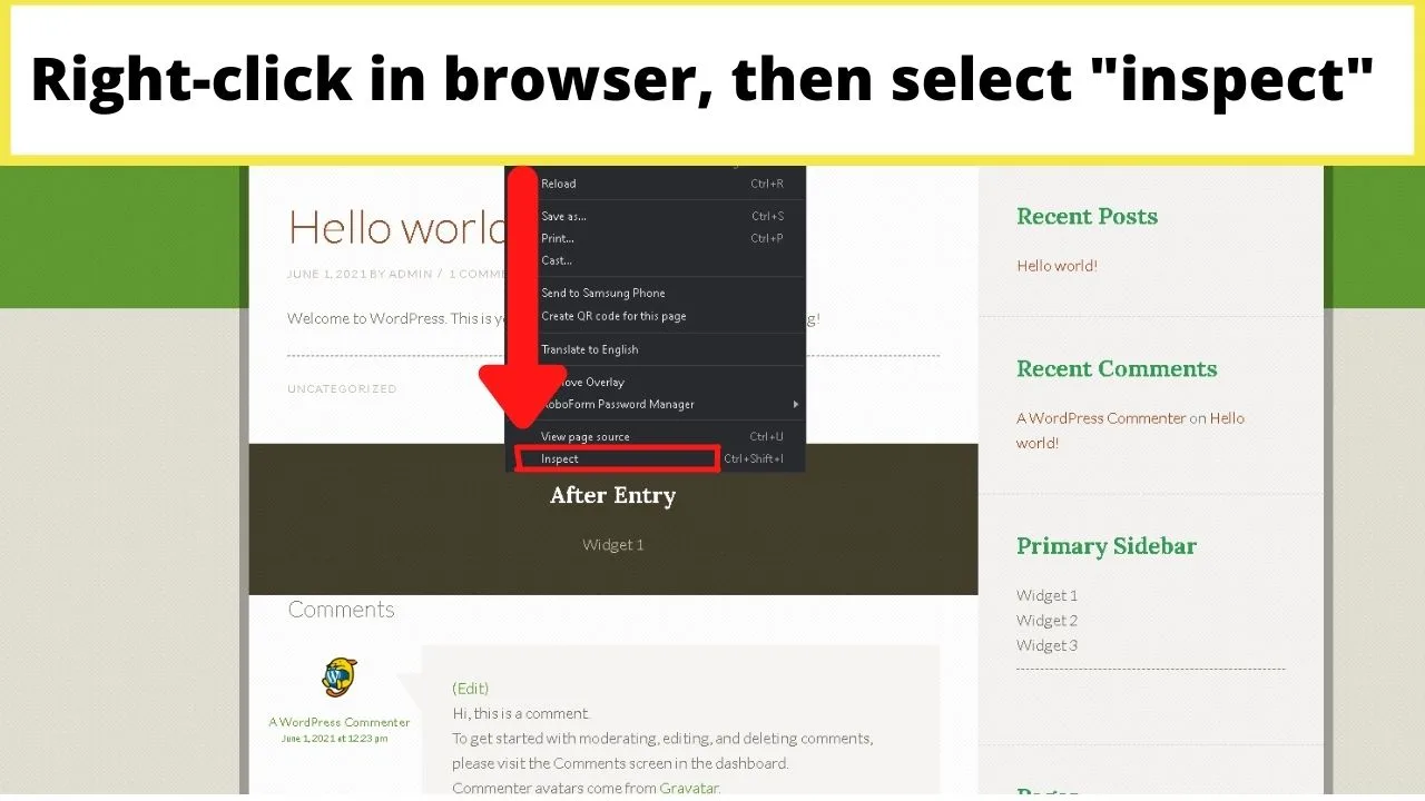
This will open a split-screen view with your site on one side, the HTML styling elements on the other.
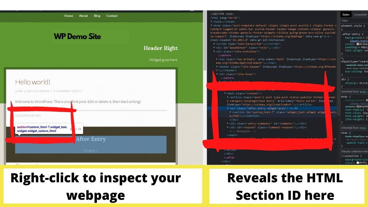

In the screenshot above, you can see that the highlighted element on the left is the “after-entry” widget area. On the right, the highlighted area shows the ID is “custom_HTML-7”.
To stop the floating sidebar from scrolling as soon as that element loads, that’s the ID to put into the Stop ID field in the general settings.
Wherever you want the widget to stop scrolling, highlight the area on your site, right-click, select inspect, and look for the ID then put that information in the Stop ID field for Q2W3.
The refresh interval is set at 1500 milliseconds by default and is fine to leave like that. The only other two fields to change are the “Disable Width” and “Disable Height”.
These will only disable the scroll feature on mobile IF you set the values. The plugin is responsive, but on mobile, widgets become stacked below your content rather than shown in the sidebar.
For a better user experience, disable these for smaller screen sizes.
- To disable on mobile, set this to disable at around 500 px. Most smartphones have a max-width of 414 pixels.
- To disable on smaller tablets too, set the disable width to around 750 px.
- Larger tablets can manage a display width of around 990 px.
- Laptops and desktops have screen sizes in the region of 1,440 px and above.
The rest of the global settings for compatibility are there for troubleshooting.
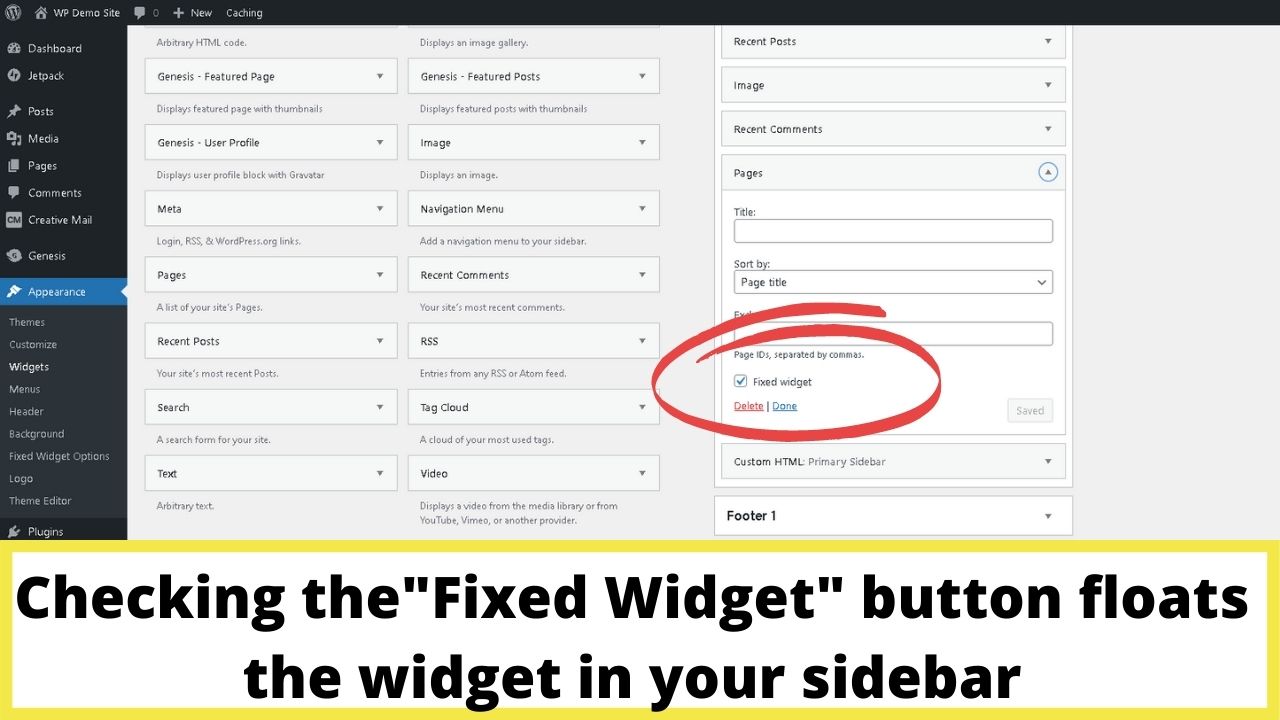
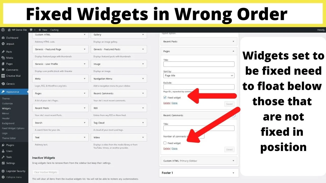
Once you have set the global settings, then configure which widgets you want to make sticky in your sidebar.
When you go back to your widgets now, each one will have a button you can check to make it a “fixed widget”, meaning it’ll float on your sidebar until it reaches the parameters you set in the global settings.
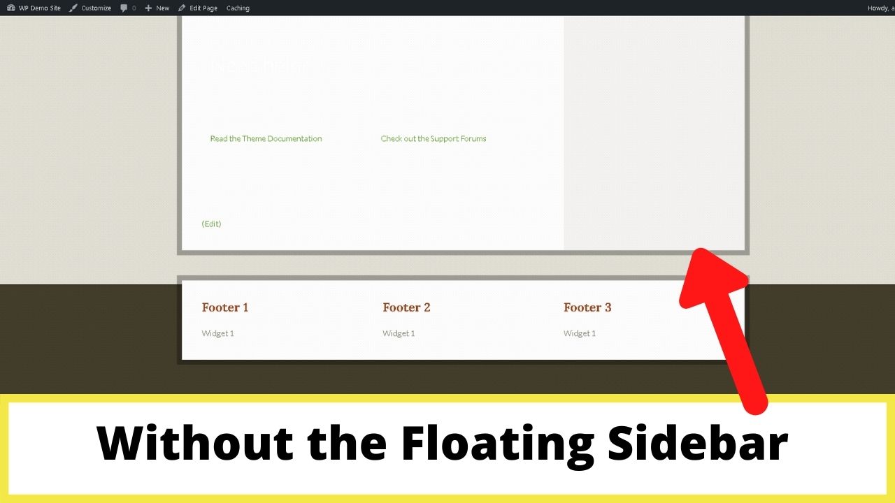
Without the floating sidebar, when users reach the bottom of the page, there’s nothing but blank space.

With widgets fixed in position, sidebar content remains visible. You can see in the image below that the pages section (set to be a fixed widget) is floating down the sidebar to the bottom of the page, but not so far that it rolls into the footer section.
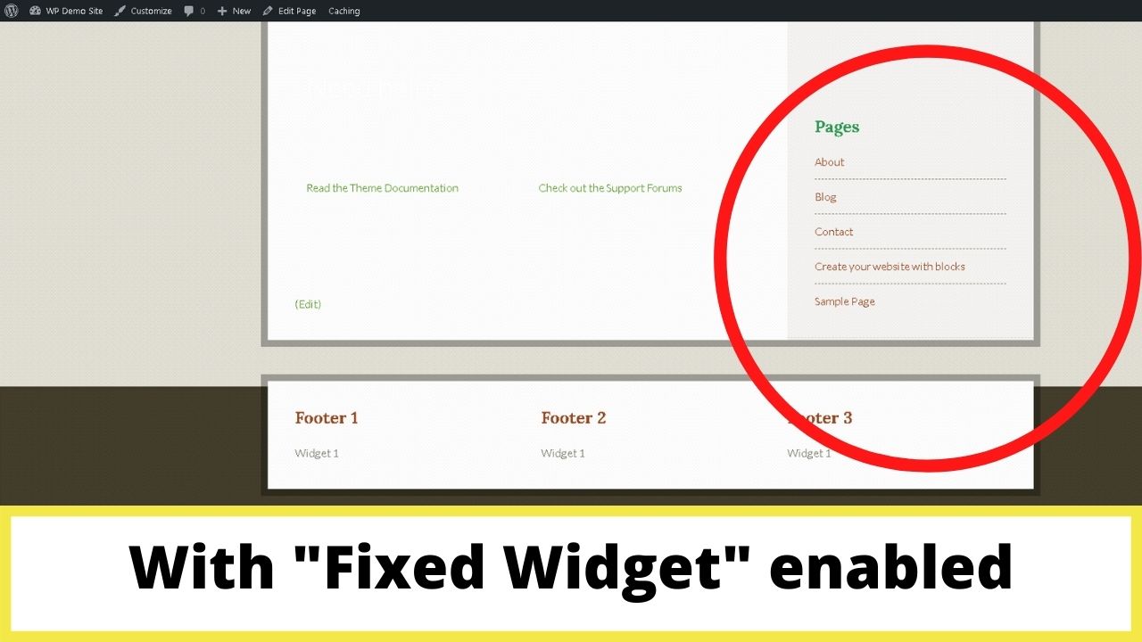
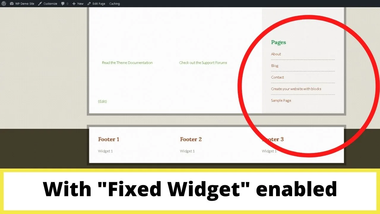
To stop the scrolling running into the footer, the “Margin Bottom” needed set for this theme to 430 px.
Without setting that in the global settings, it would carry on scrolling causing an overlap with the content in the footer.
This padding is fine on desktop, but on smaller screens, as Q2W3 is a responsive plugin, the sidebar drops to below the content.
To prevent overlap on mobile scrolling, you need to use the Stop ID functionality to stop the sidebar scrolling as soon as the lowest ID element of the page loads on the screen.
The same overlap issue happens if you fix the position of widgets above widgets that aren’t fixed in position.
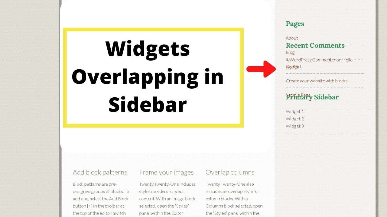
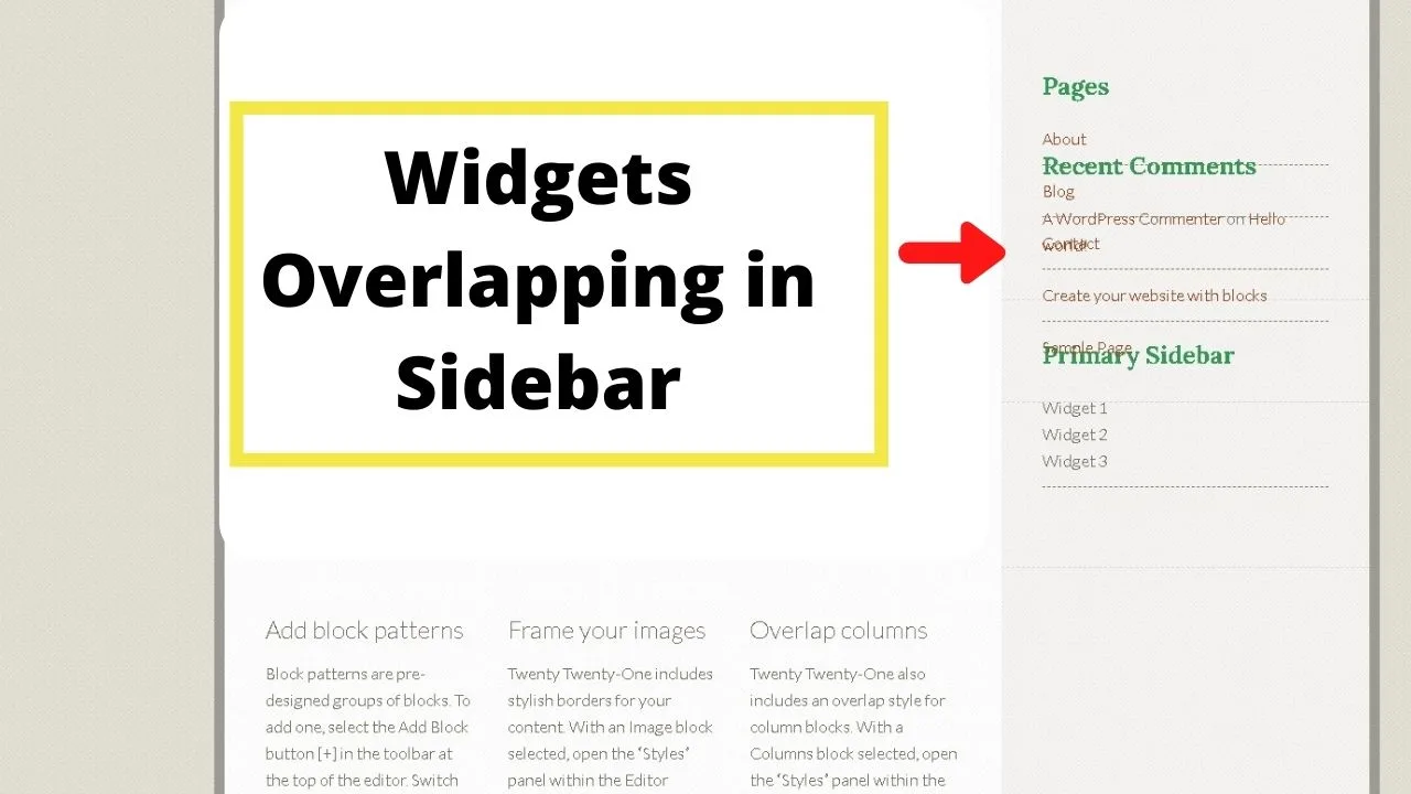
All your fixed widgets need to be placed below those that aren’t set to float. In this case, the pages section needs to be moved to the bottom of the Primary Sidebar.

Can I make a floating button in the sidebar?
If all you want is a floating button rather than a floating sidebar, there’s a plugin called the Floating Action Button plugin that may be better suited.
It can be done with the Q2W3 Fixed Widget plugin. Insert an image widget, choose an image from your media gallery and use the “link to:” field to create a hyperlink.
The tel protocol makes phone numbers clickable. Other codes you can use that replace the tel protocol are “callto” for Skype calls, “wa.me<number>” for a Whatsapp call, “sms” for click to text buttons, and “mailto” for email buttons that launch an email app when clicked (or tapped on smartphones).
Can a floating sidebar be made dynamic?
The Q2W3 is handy for WordPress floating sidebars but it doesn’t (currently) support dynamic content, meaning, when you fix widgets in position, they’re applied sitewide.
It is compatible with the Widget Options plugin that lets you control which widgets are shown on a per page, category, and/or post basis.
Combine those two plugins, and you can make your sidebars dynamic, responsive, and sticky. Those two plugins are a powerful stack for increasing user engagement and bumping your conversions up.


Hey guys! It’s me, Marcel, aka Maschi. On MaschiTuts, it’s all about tutorials! No matter the topic of the article, the goal always remains the same: Providing you guys with the most in-depth and helpful tutorials!