Having a hard time evenly spacing your lines, shapes, and other elements in Canva?
Well, if you have a keen eye for it, you can most definitely go with manually placing your Canva elements with the guidelines to help you.
But, if you’re doing work that requires utmost precision, eyeballing won’t make the cut.
Thankfully, Canva listens to their users as they placed a nifty spacer in the tool for everyone to fully enjoy.
So, if you’re ecstatic to learn how to evenly space Canva elements, keep reading!
How to Evenly Space Elements in Canva
To evenly space elements in Canva, you first need to highlight all of the elements you need to align by clicking on them. After which, click the “Position” tab on the editor toolbar. Head to the “Space Evenly” option and choose whether to space elements vertically or horizontally.
To evenly space elements in Canva, follow these steps:
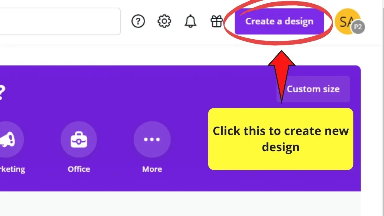
Step 1: Click on “Create a design” on Canva’s homepage
Step 2: Head over to the Elements tab and add some elements
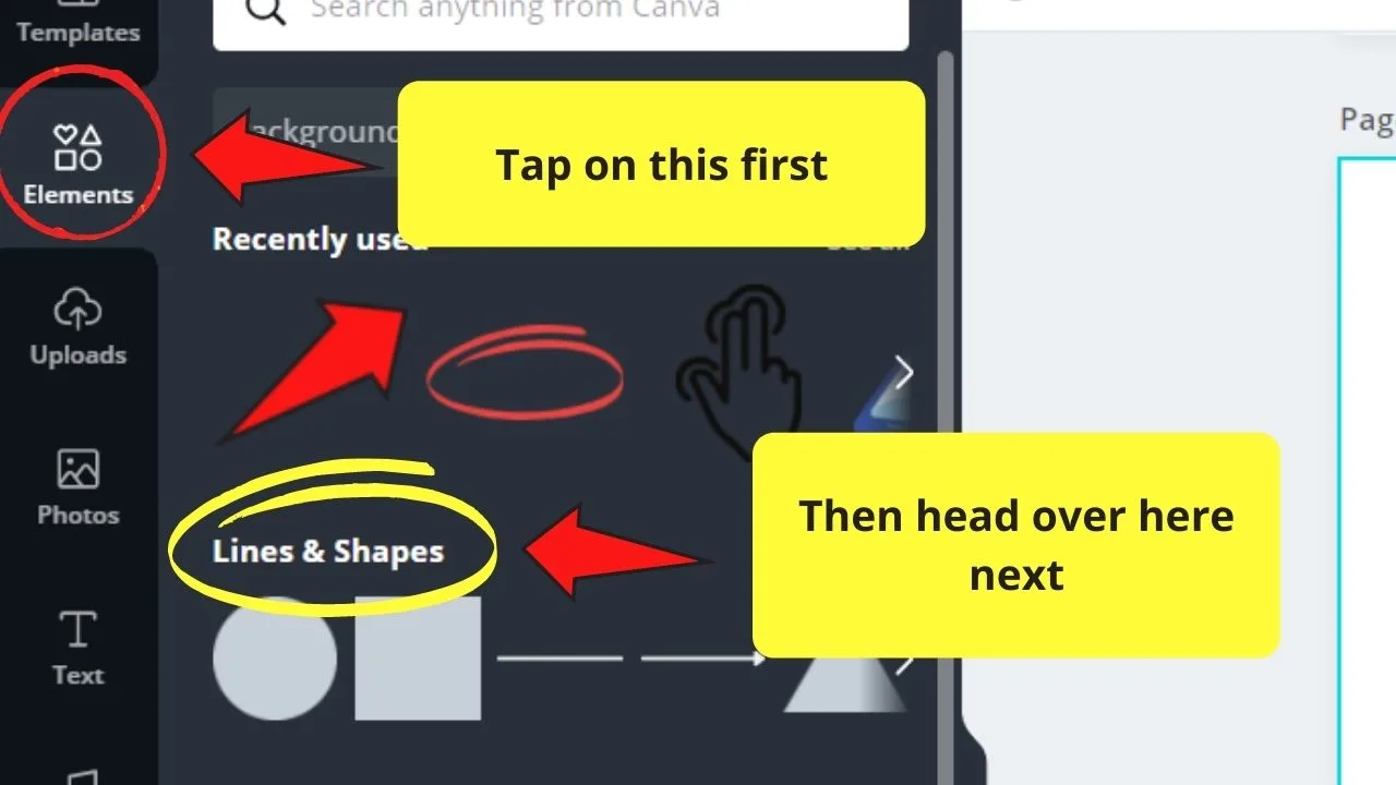
For example purposes, we’ll simply use lines, but you can use this feature for other Canva elements as well.
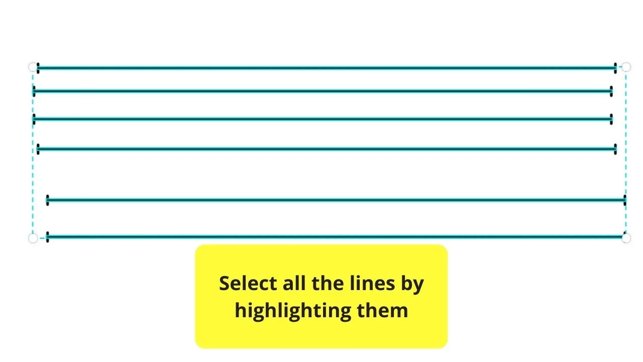
Step 3: Select all the objects that you’ve added either by tapping on them individually while pressing on the Shift key, or dragging the cursor across them to highlight all of them in one go
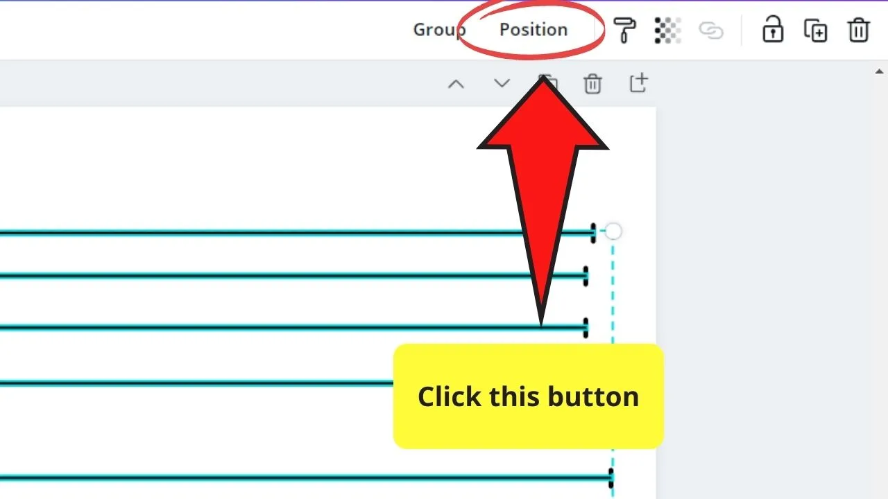
Step 4: Once all the elements are highlighted, head over to the editor toolbar and tap on the “Position” button
Step 5: Head to the “Space Evenly” option.
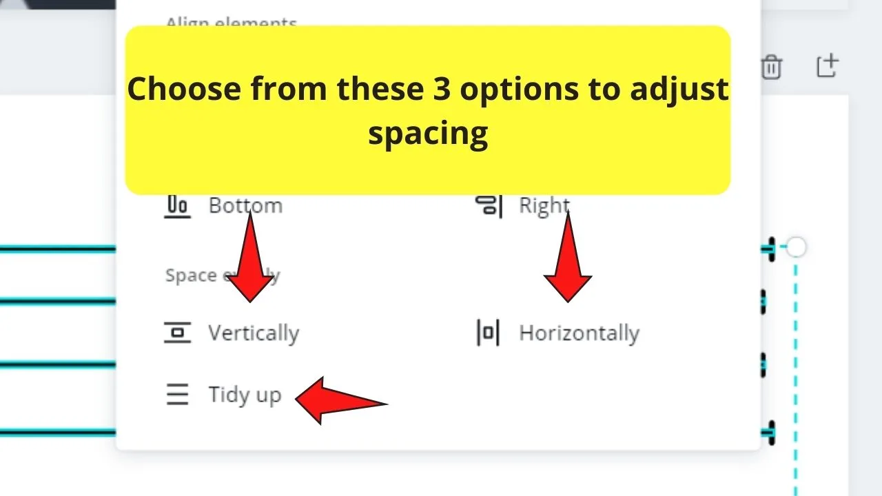
Step 6: Tap on the “Horizontally” spacing option if you want alignment your elements horizontally
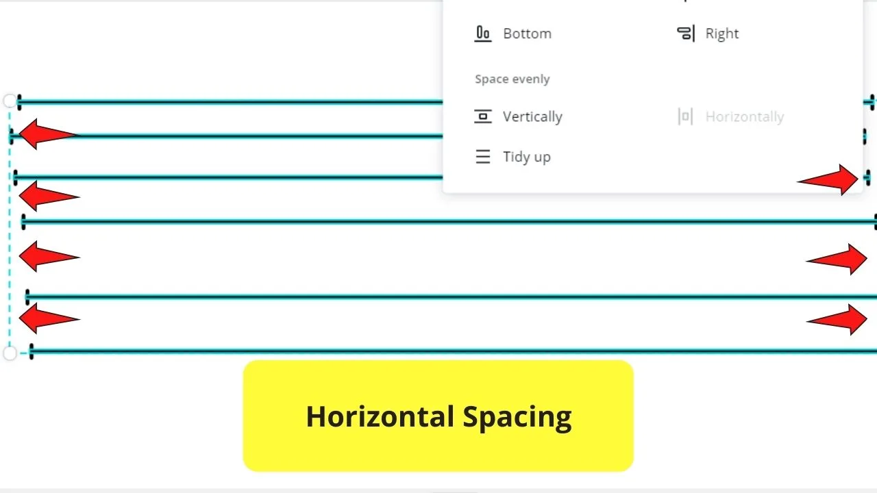
Step 7: Click on the “Vertically” spacing option to make sure the elements are perfectly aligned vertically
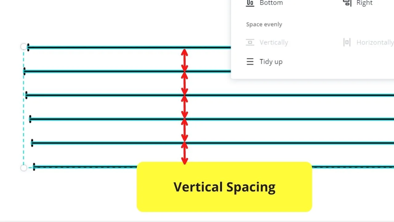
You can even tap on the “Tidy up” option if you want to polish the spacing between the lines.
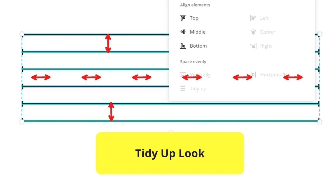
And, with just a mere click on your mouse, you can ensure the even spacing of your elements on your design.
What’s more, you can use this fun tool for shapes and other graphics found in Canva’s element gallery.
But, what if something’s wrong with Canva, and that the “Evenly Spacing” feature’s not working?
Are there other ways for you to ensure even spacing of all the elements you’re using?
How to Evenly Space Text in Canva
Elements, whether images or graphics, aren’t the only ones you can evenly space in Canva. With new features added, you can now evenly space text in this tool, too.
To evenly space text in Canva, follow these steps:
Step 1: Select the text
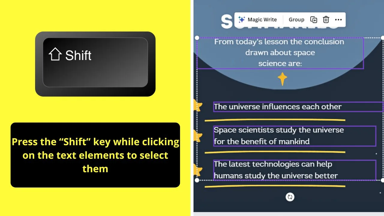
Do this by pressing “Shift” while clicking the text elements you want to highlight.
Step 2: Click “Position”
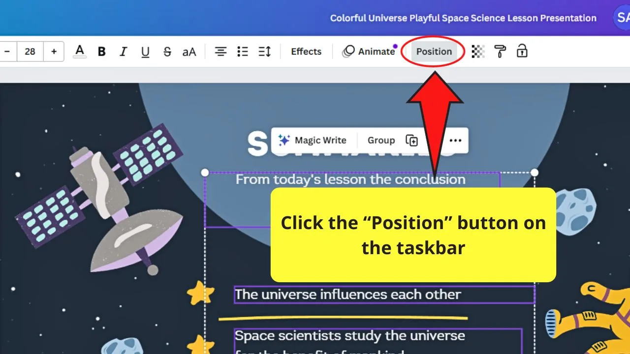
You’ll find this option between “Animate” and “Transparency.”
A side panel then opens on the editor’s left side appears.
Step 3: Select “Tidy Up”
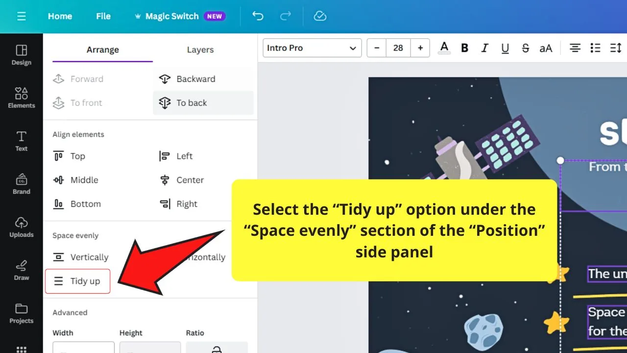
This is the third option found in the “Space Evenly” section of the “Position” side panel.
When you click this option, the spaces between the lines will be evenly distributed horizontally and vertically.
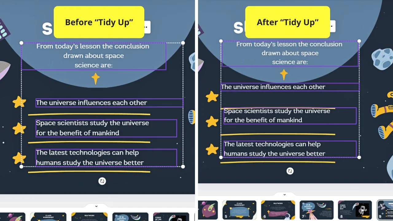
But if you don’t want the look of the tidied-up text, simply undo the changes with the “Undo” button.
Step 4: Adjust the spacing of the lines and letters of the selected text
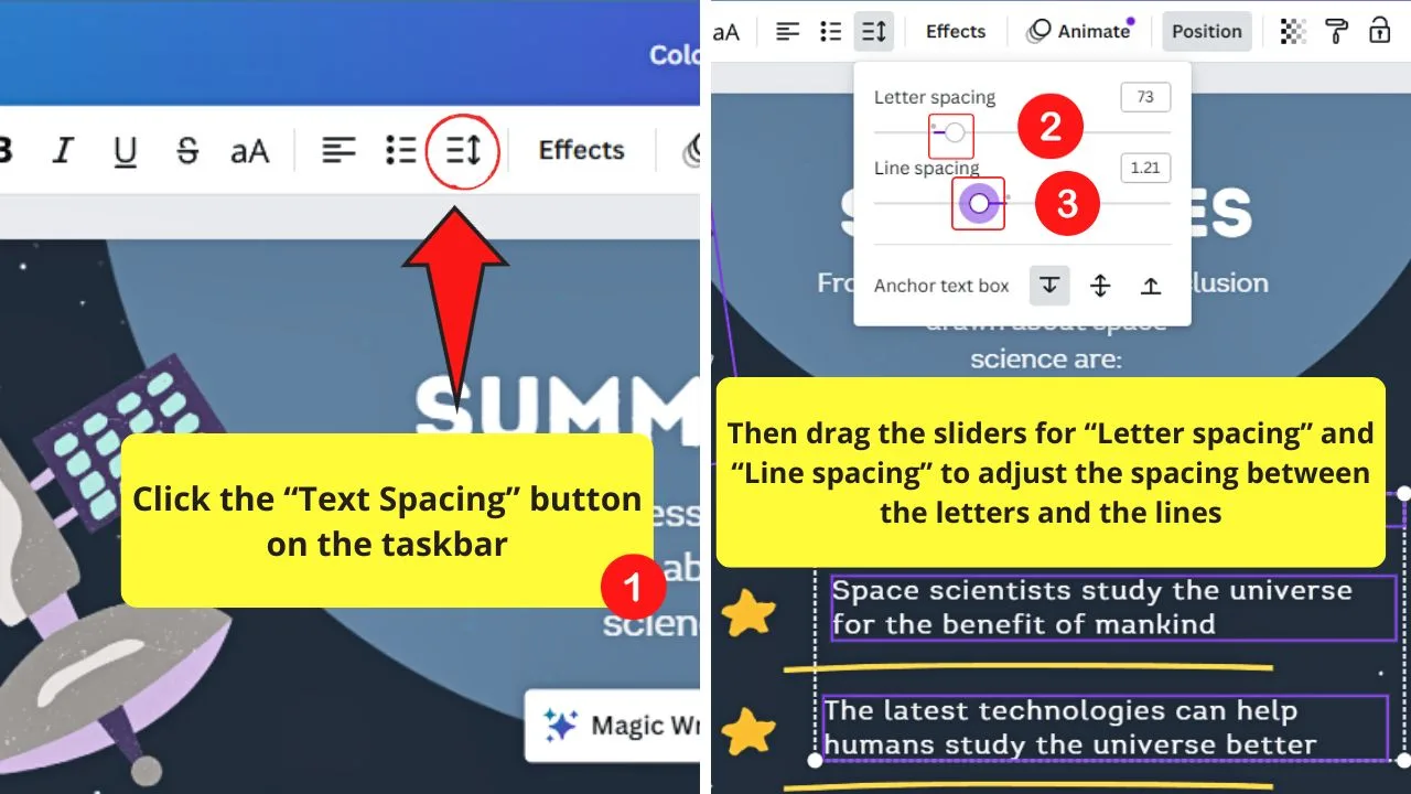
Do this by clicking the “Text Spacing” button on the taskbar.
Then drag the “Letter Spacing” slider to decrease or increase the space between the individual letters.
You can also drag the slider for “Line Spacing” to decrease or increase the space between lines of text.
Once done, click anywhere on the design to exit the “Text Spacing” box.
Other Alignment Options in Canva
As everyone knows already, the swiftest way to align and ensure even spacing among your elements in Canva is through the “Evenly Spacing” option in the “Position” tab.
But, long before this feature’s part of Canva’s arsenal of tools, ensuring even spacing is such a chore.
Yet, as the “Evenly Spacing” option wasn’t out yet, most of the Canva users then had to be creative in using a workaround.
So, if you’re curious enough to learn about other means of spacing your elements, better stay tuned.
Method 1: Use of the Square
For newbies, you’ll think squares merely are for decorative purposes, such as placeholders and color filler for text boxes.
You can even use squares as frames for a fun element to your design.
So, here’s how we use the square to even out the spacing between elements:
Step 1: Select “Elements” on the left side panel
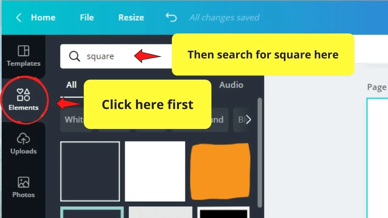
Step 2: Type “Square” on the search bar
Step 3: Select the square shape from the object panel
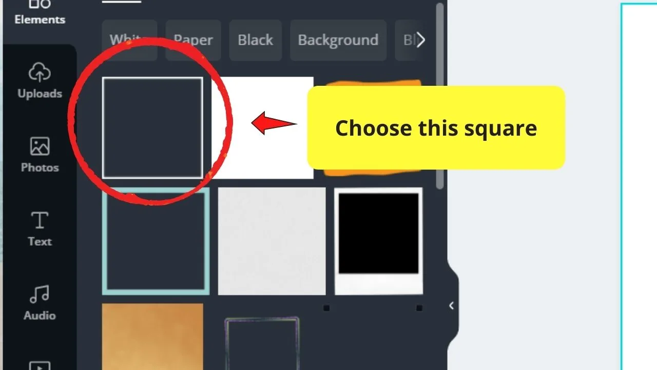
Even the simplest square design will do — after all, you’ll only use this element for spacing purposes.
Step 4: Resize the square by dragging the white circles on its corners downward
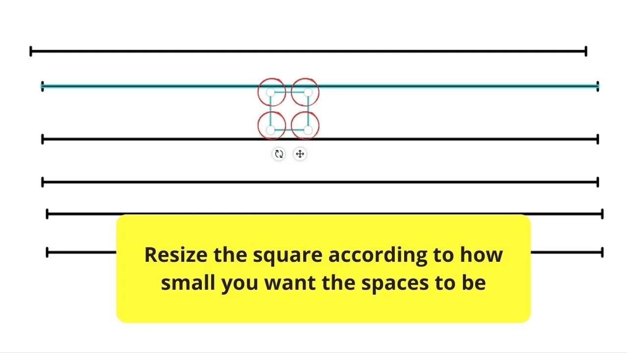
Adjust accordingly and change its color depending on your preference.
Step 5: Drag and place the square in between the lines or elements to check for their spacing
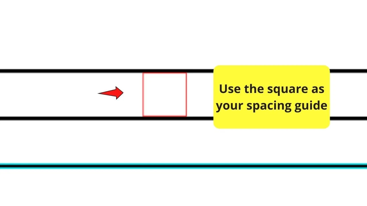
Think of the square as your guide in this task. Then delete it once you’re satisfied with the spacing.
But, if you find this method a bit cumbersome, then perhaps the second method will be much easier for you.
Method 2: Multiple Rectangles as Spacing Guides
Step 1: In the “Elements” gallery, scroll down to “Shapes” and click on a rectangle
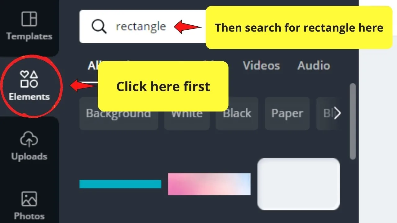
Step 2: Resize the rectangle by dragging the white circles and handles until you get the desired shape size
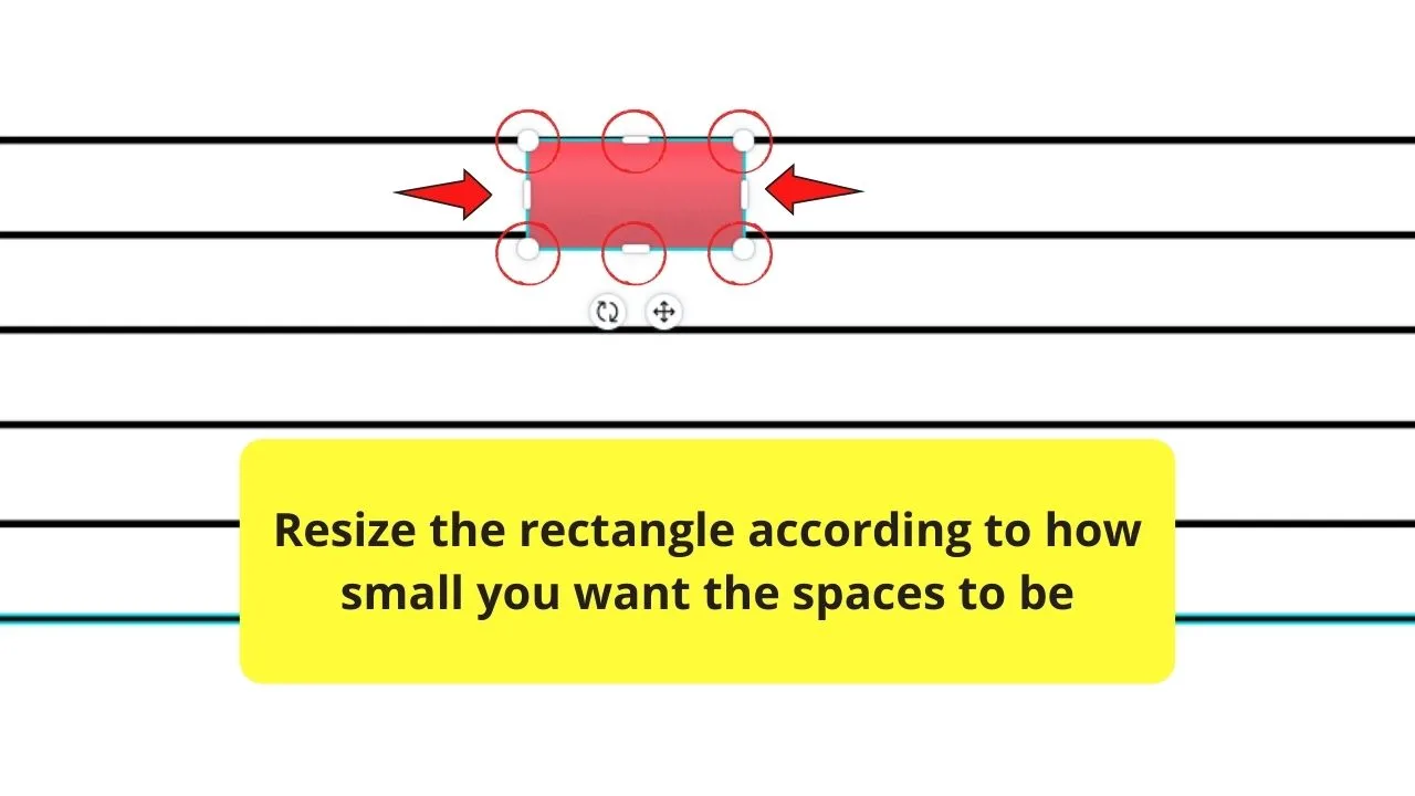
Step 3: Create copies of the newly-resized rectangle depending on how many rows of elements are present
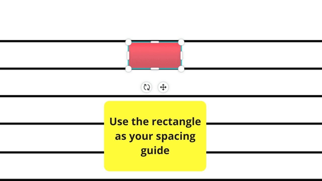
Refer to the keyboard shortcuts mentioned earlier in this text for ways on how to create multiple copies of a particular element.
Step 4: Place the rectangles in between the elements for a visual check on their spacing.
Adjust the elements accordingly.
Step 5: Delete the rectangles from the design
Do this only when you’re satisfied with the elements’ spacing.
Quite tasking, right?
However, there’s still one tactic that you should know about.
Method 3: Using Purple Guide Lines
Step 1: Add elements to your design

Select the “Elements” tab in the left-side menu.
Then scroll down the “Elements” gallery to search for the graphics you’ll need, or encode the term in the search bar.
Step 2: Click on the elements you’d like to add to make them appear on the canvas
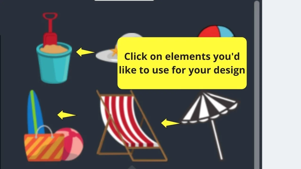
Step 3: Position one of the elements accordingly on how you want them to appear on your design
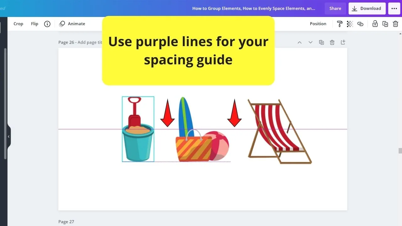
Select another element on the canvas and place it beside the first element you’ve positioned earlier.
Purple lines will then appear to guide you with the alignment.
But, what you don’t know is that these purple lines can also be used for spacing.
Simply drag the elements nearer until you get the spacing you want. Think of it like a modified eyeballing technique.
But, lucky you, you won’t need to undergo these 3 processes just to ensure proper spacing of your elements.
You’d have to thank Canva’s developers for making our lives easier on this task.
But these 3 methods are good-to-know tactics should you find the spacing feature not working.
Frequently Asked Questions about How to Evenly Space Elements in Canva
Can you activate the spacing feature if you click on one element only?
Unfortunately, you cannot use the spacing feature in Canva if you only select one, or even two elements. You have to select at least elements for you to activate such a feature.
Why won’t the spacing feature appear?
If you can’t find the spacing feature in the “Position” menu, it’s probably because you didn’t select enough elements to activate it. For this feature to appear, you need to choose at least 3 elements.
Is it possible to dictate how much spacing you want in between elements?
Though you use Canva’s spacing feature, you cannot adjust how much the space is between the elements manually. There’s currently no option for that. You can only choose whether to space the elements horizontally or vertically.

Hey guys! It’s me, Marcel, aka Maschi. On MaschiTuts, it’s all about tutorials! No matter the topic of the article, the goal always remains the same: Providing you guys with the most in-depth and helpful tutorials!


Judith
Friday 2nd of September 2022
Thank you so much for this thorough explaination. Much clearer than YouTube video where they assume you know what to click. I'm very grateful.