When designing a logo in Canva, prioritize a clutter-free design with legible Serif fonts for easy brand recognition.
Here are the top Serif fonts available in Canva.
The 12 Best Serif Fonts in Canva
- Merriweather
- Brixton
- Cardo
- Buenard
- Playfair Display SC
- Lora
- Roxboroughcf
- Unna
- Mak
- Rufina
- Suranna
- Quattrocento
Serif Fonts in Canva — The 12 Best
What do you know about Serif fonts? Are they the same with Sans serif fonts?
Their main difference is the absence and presence of serifs, or decorative lines, at the beginning and end of the letter’s stem.
Think of it like letters having tails or feet for decorative purposes.
With that in mind, serif fonts have these decorative tapers, while the sans serif fonts don’t have these (sans means none literally).
These tapers add a traditional feel to your branding. And, if you haven’t noticed, most newspapers, books, and magazines use this font.
So, if you aim to make your potential customers feel that you’re trustworthy, reliable, and stable, then serif fonts are your go-to.
Enough with the history talk.
Let’s all go see what are the best serif fonts that Canva has to offer, starting, of course, with the most popular among them.
1. Merriweather
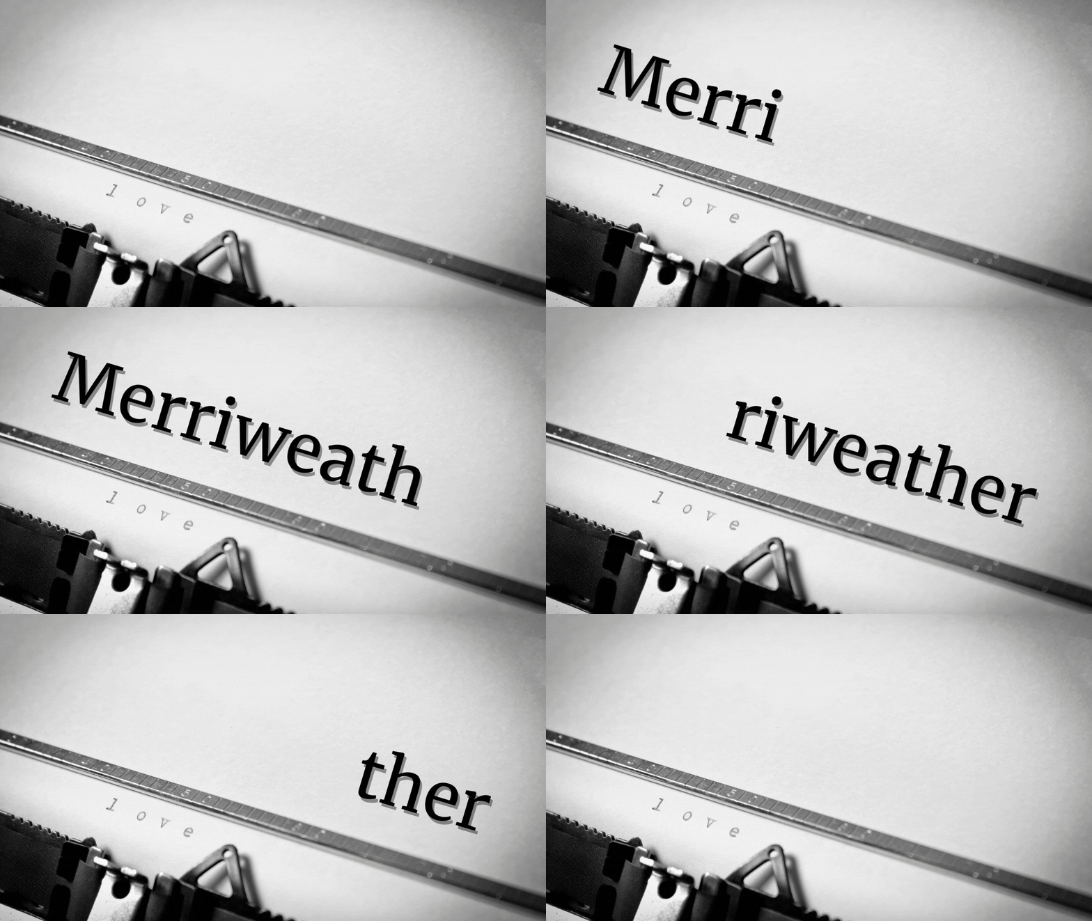
If you’re aiming for a classic yet modern vibe on your branding, Merriweather’s a good choice for your text. This is especially true if your business is leaning towards creating e-books and videos.
Why is that so? Well, Merriweather’s designed by Sorkin Type to be a pleasant font style to read on screens.
And, as we all know, reading for long periods on screens can strain the eyes. But, with Merriweather’s readable strokes, you won’t be squinting to decipher the message.
Hence, not only is Merriweather recommended as a font for on-screen text, you can also use this for your resume.
But, a grain of caution, though. Better use this font only for the body of the text rather than headings
2. Brixton
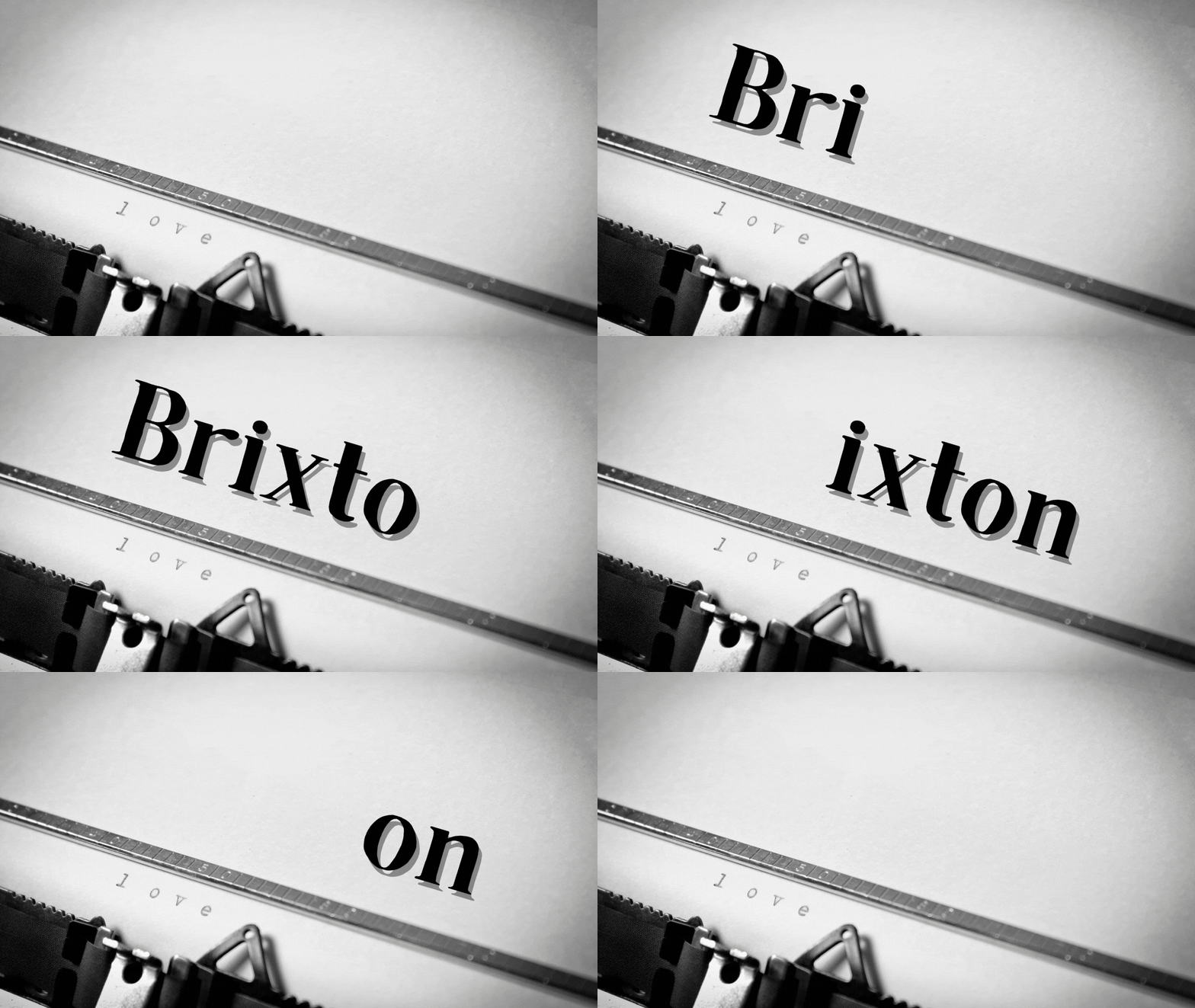
Now, if you’re a fan of letterpress style fonts, or if your business is based on vintage stuff, then Brixton’s the right font to use.
With narrow yet powerful strokes, Brixton gives that timeless vibe while maintaining the letters’ legibility.
Hence, if you’re working on some historical piece, Brixton’s the best font to bring out that vibe.
Especially if you write in all caps with this font, you can’t help but feel a bit nostalgic and imagine you’re in a different time.
This font looks best when used on posters or campaign ads aiming for an impactful message.
3. Cardo
Who’s familiar with the Renaissance period here? Well, if you’re a history buff, you’ll know that the Renaissance’s a period of great rebirth in terms of wisdom and learning.
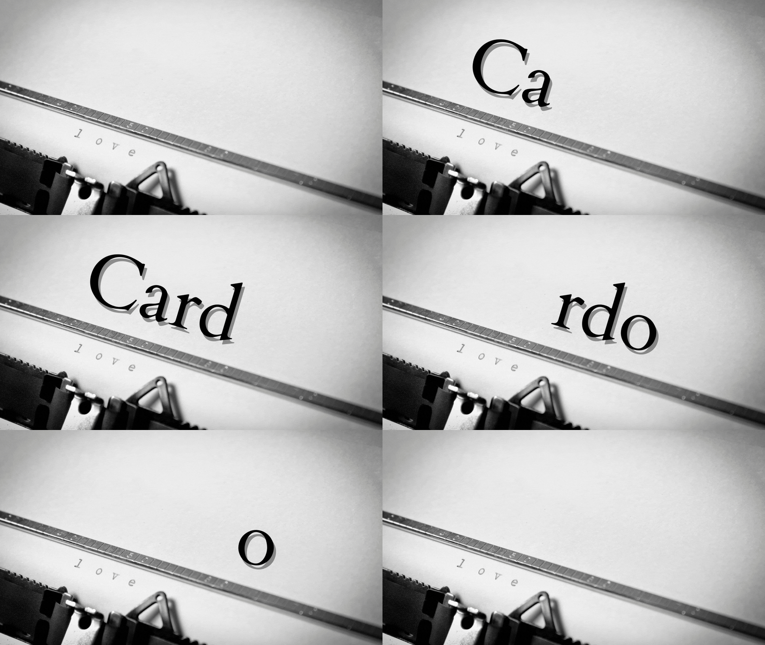
If you aim to bring the Renaissance vibe to your branding, Cardo’s the best font you’ve got from Canva.
Designed by David J. Perry way back in 2002, Cardo is the go-to font style for linguists, biblical scholars, classicists, and medievalists.
After all, one look at any text written in Cardo is enough to transport you through a period where knowledge was the most valued commodity of their time.
So, if you’re designing history class-related presentations, you can use Cardo to help make your students feel the Renaissance vibe.
4. Buenard
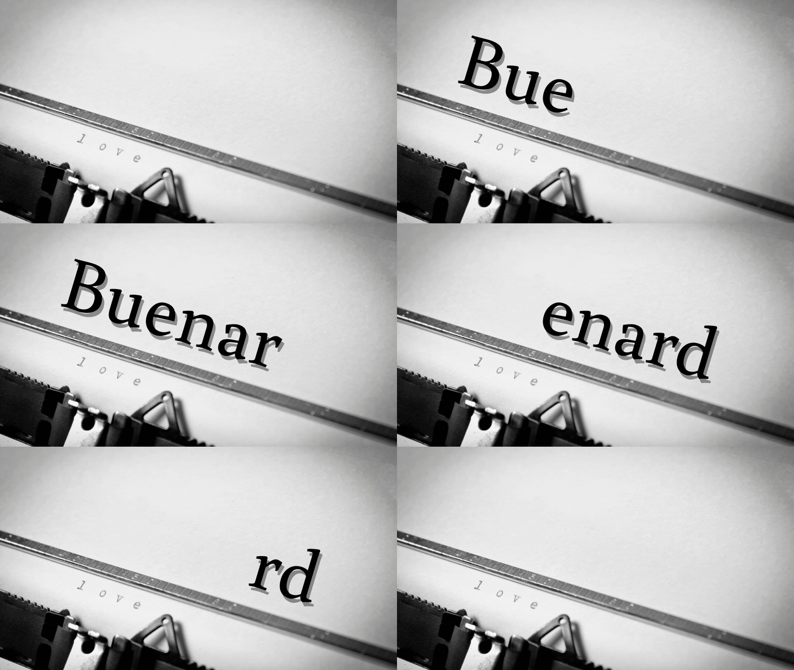
Do you love reading coffee table books or even stare at the stunning painting examples in art books?
While you’re mesmerized by the intricacy of the details on those paintings, the font used on the text is equally stylistic as well.
Elegant, contemporary, consistent, and legible are just some descriptives you can associate with text written in the Buenard font.
So, if ever you’re working on designs related to art, or you’re writing coffee table books, you can consider Buenard as a strong contender.
This font would even look good on a business card — most especially if you’re an artist yourself!
5. Playfair Display SC
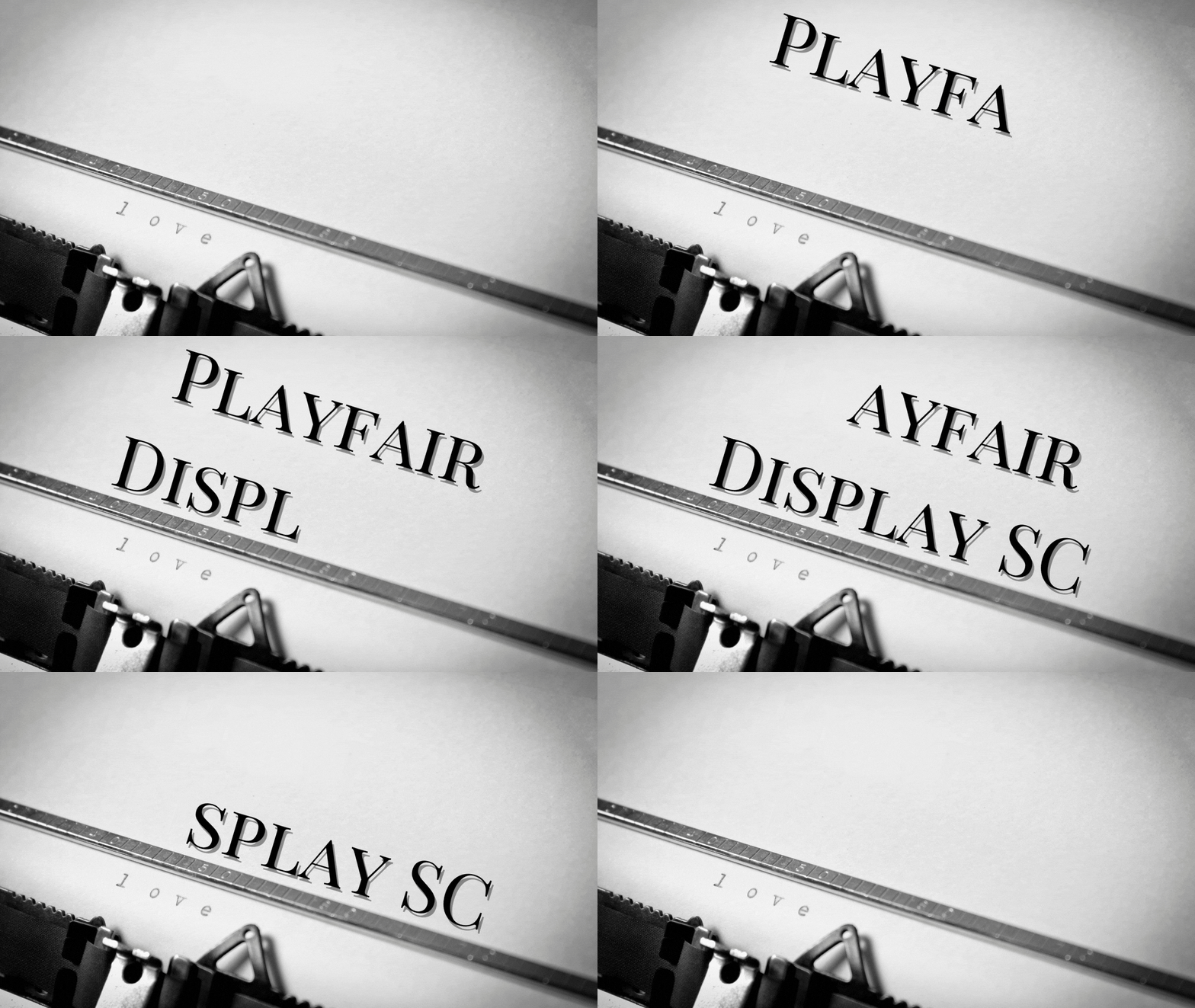
Now, if you’re a fan of writing in Caps Lock (especially if you’re trying to shout at someone — silently), then Playfair Display SC’s the best font style for you.
Technically, Playfair Display SC’s a transitional design founded in the European Enlightenment. During that time, pointed steel pens slowly replaced the elegant strokes that broad nib quills bring.
With the increased usage of ink and paper, it’s understandable that typeface masters at that time look for more detached letter styling.
Even I can’t help but imagine being inside a theater, reading the pamphlet describing to me what I should expect from the play I’m about to watch.
So, if your business is focused on theatrical stuff, or you just want to bring out the feeling of the Enlightenment to your writing, then use this font.
6. Lora

Now, who’s into calligraphy these days? If you are, you’ll perhaps be surprised to know that a Serif font’s part of the brush strokes that you can incorporate in your designs.
Well, technically, Lora has its roots based on calligraphy. It’s sort of a more contemporary twist to the feminine brush strokes, you know.
With that said, you’ll find that the serifs have more of a brush-look finish as compared to the other Serif fonts that are more straight or driving serifs.
Hence, if you’re working on a romance novel, Lora is one of the best fonts that you can use in the body of the text.
Yet, Lora isn’t only for printed text; it also works well with text you see on screen. So, the moment you see it, you’re brought into a dreamy world that’s set in modern times.
7. Roxboroughcf

Now, another great Serif font you can add to your arsenal if you’re into calligraphy is Roxboroughcf.
Though it sounds like a handful, this font adds an artsy vibe to your packaging design, copy, subtitles, and even display design.
Among all the Serif fonts, Roxboroughcf’s more of a dramatic serif, a crossbreed between hand lettering and calligraphy.
Best done in italics, Roxboroughcf’s described as both traditional and chic. So, if you’re a woman entering into the perfume or makeup industry, you can give this font style a try.
Who knows, Roxboroughcf’s the key for you to attract more business clientele.
8. Unna
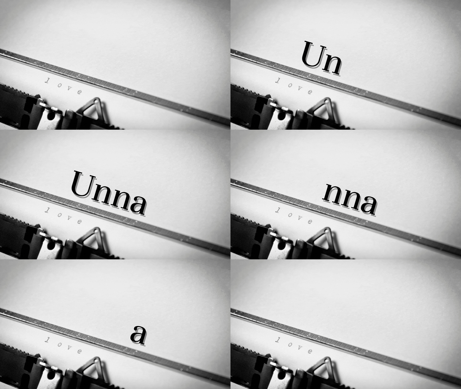
Another transitional Serif font that’s best used on literary books is Unna. As short as its name is, Unna serves to bring a neoclassical vibe to your text.
One interesting fact about this font is that the designer, Jorge de Buen, was inspired to design this font due to his mother’s surname.
It’s enough to see how his fondness for such a surname brought about the strongness of the stems as well as the delicateness of the serifs.
Think of it as the marriage of strong and delicate in this very font style — the very essence of a male-female marriage.
Who knows? You might use this soon on your wedding invitations if you feel like putting up a literary theme to it.
9. Mak
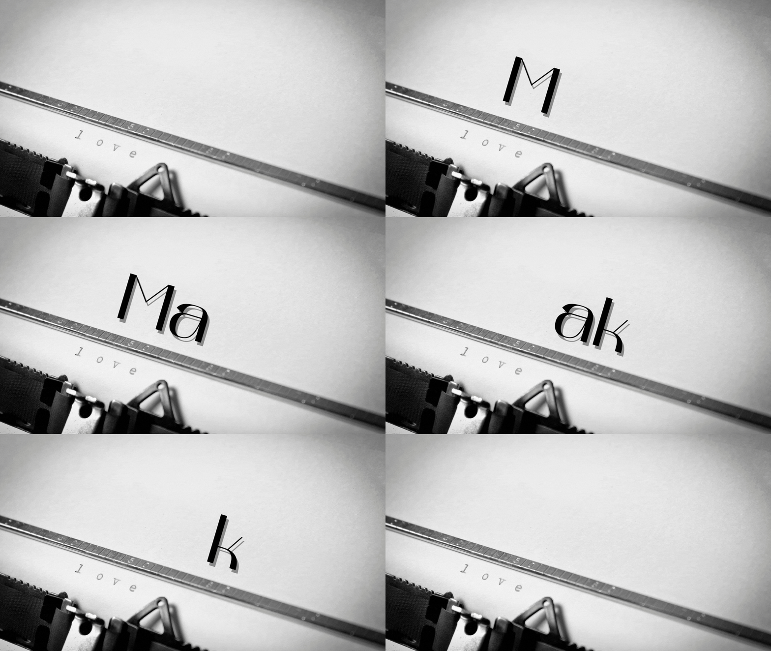
Are you the happy-go-lucky type of person who loves nothing more than to experiment with various font styles on their logos?
Well, if your answer to that question’s yes, then Mak’s the font style you’ll use for your upcoming designs.
Based on the Ukrainian historical letters, Mak’s an experimental font style based on them.
If you’ll notice, Mak’s got a unique marriage between rectangular entry points and the more rounded styles of the lobe points.
What’s more, it’s a great mix of thick and thin letter strokes. It makes you think that the person writing it has such dexterity when using broad marker pens.
So, if you’re up for some eccentric feel to your branding, then Mak is where you can place your bet on.
10. Rufina
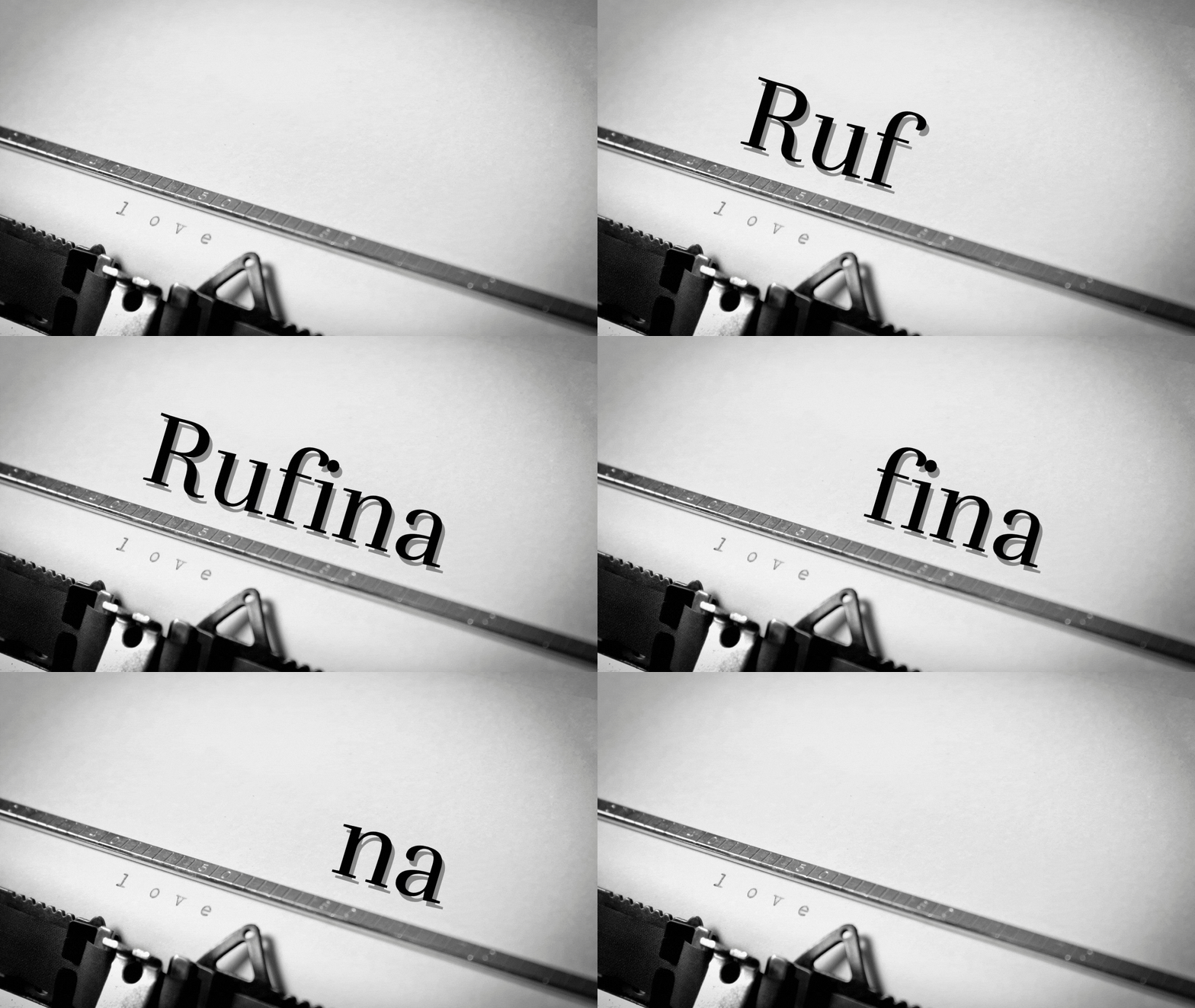
Now, now, now. Are you tired of seeing masculine-feel Serif fonts? Well, if you’re a dainty female, then take a look at what Rufina can do to your text.
With its delicate, elegant, yet simple strokes, one look into the Rufina font style will send you dreaming.
And, if you’re a fan of contrasts, Rufina’s the best font that you can use if you’re planning to use light backgrounds and dark text.
The designer of this font style originally used dark text on light backgrounds. Hence, the text written in this font subtly seduces its viewers with its refined and time-distant strokes.
So, with that, I’ll use Rufina for Boho-inspired branding concepts and parties. I’m even considering using this typography to write my labels for plant containers.
11. Suranna
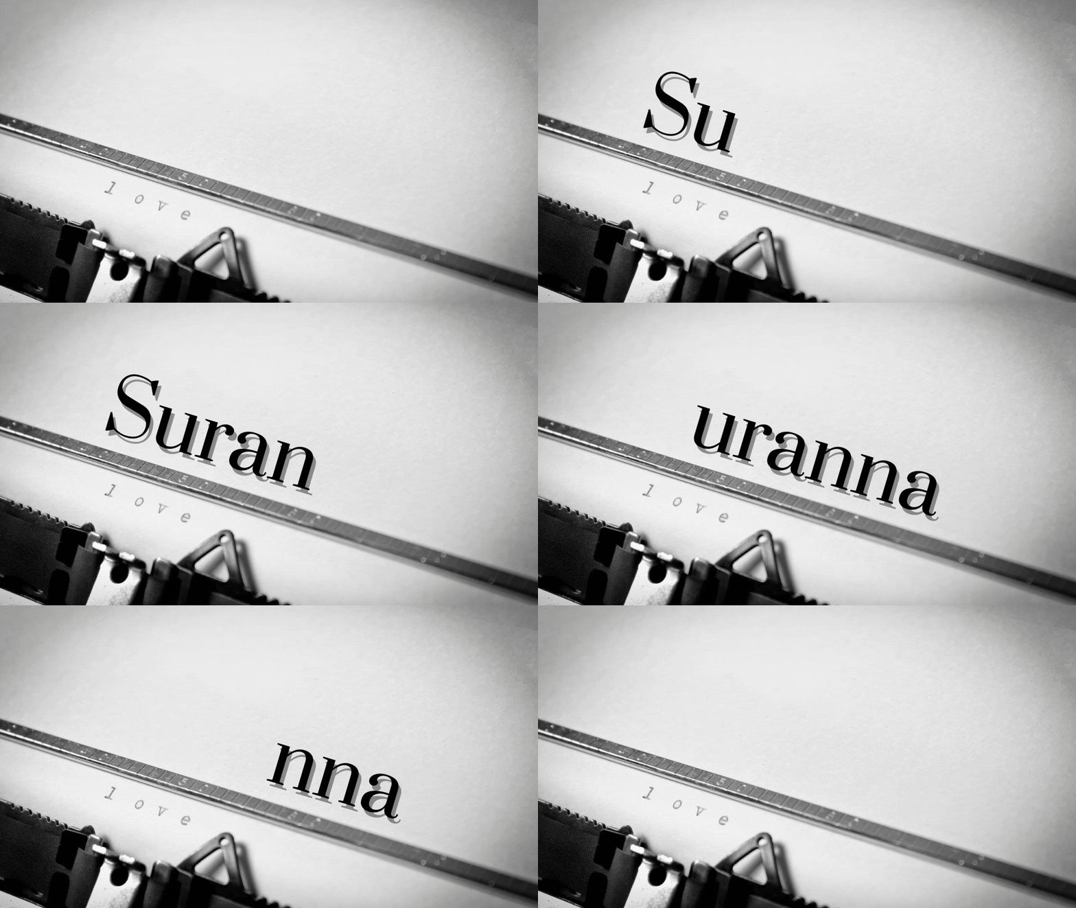
Is it possible to see a hint of a foreign language in the font? Well, if you haven’t encountered the Suranna font, then I bet you won’t even believe it.
Yet, it’s impossible for anyone to miss out on spotting this font as everyone’s reading newspapers.
Yep, you heard me right on this one. Most news publications use Suranna as their font style.
With the heavy weight focused on the bottom part of the letters, it gives that this is business-no-nonsense vibe to the text. Plus, it’s neat and legible.
Going back to that foreign language bit, you’ll be surprised to know that Suranna’s got its roots in a Telugu poet.
So, if you’re eager to throw a newsroom-themed party of some sort, you better not forget to use Suranna as your font for the invitations.
12. Quattrocento

Is this font designed sometime in the 1400s by someone Spanish in nature? Well, despite its Spanish vibe, Quattrocento, unfortunately, isn’t even anywhere close to Spanish.
Quattrocento is a Roman typeface described as strong and sober, classic and elegant. If you take a good look at the font, the letters are quite widely spaced apart.
Plus, with its great height, you won’t be having trouble reading small text written in this font. So, if you’re saving up on space on your logo, then perhaps give Quattrocento a try.
Also, if you’re planning to create some visual aids in history or literature classes, Quattrocento looks good even from the back.
Add that the capital Q in this font is unique, with the line only tangentially touching the O instead of intersecting it diagonally.
But, if cursive fonts are your thing, you can have a look at the 12 best cursive fonts on Canva.

Hey guys! It’s me, Marcel, aka Maschi. On MaschiTuts, it’s all about tutorials! No matter the topic of the article, the goal always remains the same: Providing you guys with the most in-depth and helpful tutorials!
