
Today, we will see how to plot a list in Python. We will use the matplotlib library. It is a popular Python library for data visualization.
Using this, we can easily plot a list in a few lines of code. So, without further ado, let’s get started.
Consider the following code to plot a list.
import matplotlib.pyplot as plt
import random

data = [random.randint(0, 20) for i in range(0, 10)]  #create a list of 10 random numbers

plt.plot(data, color='magenta', marker='o',mfc='pink' ) #plot the data
plt.xticks(range(0,len(data)+1, 1)) #set the tick frequency on x-axis

plt.ylabel('data') #set the label for y axis
plt.xlabel('index') #set the label for x-axis
plt.title("Plotting a list") #set the title of the graph
plt.show() #display the graph
Let’s understand this code step by step.
First, we import the pyplot module of the matplotlib library. We import it as plt, which is just a commonly used abbreviation.
Then, we create a list of 10 random numbers between 0 and 20.
Now that we have the data, we plot it using the plt.plot() method. Since we have one-dimensional data, items in the list get considered as y-values. By default, [0, 1, 2, 3, …, 9] list is taken as x-values.
Therefore, we can say that indices are on the x-axis and list items on the y-axis. We also pass additional arguments to style the plot.
We set its color to magenta. We use a circle-shaped marker to highlight a data point and fill it with pink.
After that, we use some methods to improve the readability of the graph.
We add a title to the graph using the plt.title() method.
We also set x-axis and y-axis labels.
Moreover, we change the step size on the x-axis to 1 using the plt.xticks() method.
Finally, we display the graph using the plt.show() method.
The output of the above code is shown below.

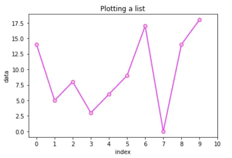
Plotting a list in Python
Here are a couple more interesting articles on Python that are mainly geared towards beginners:
- How to Return a List in Python
- How to Check if the String is Empy in Python
- How to Subtract two Lists in Python
- How to Add Space in Python


Hey guys! It’s me, Marcel, aka Maschi. On MaschiTuts, it’s all about tutorials! No matter the topic of the article, the goal always remains the same: Providing you guys with the most in-depth and helpful tutorials!