Our Math teacher just gave us an assignment about our lesson on pie charts.
The problem is that he requires us to submit our completed pie chart in Google Docs.
So, how do you go about creating pie charts in Google Docs?
Not to worry, as we’re here to learn how.
How to Make a Pie Chart in Google Docs
How to Edit Pie Charts in Google Docs
How to Create a Pie Chart in Canva (and then Upload it to Google Docs)
Frequently Asked Questions about How to Create a Pie Chart in Google Docs
1. How to Make a Pie Chart in Google Docs
To make a pie chart in Google Docs, click “Insert” on the main menu, then choose “Chart” followed by “Pie.” Then, edit the chart’s appearance and entries in Google Sheets. When you are done with the adjustments, click the “Update” button in Google Docs, located at the top of the pie chart.
2. How to Edit Pie Charts in Google Docs
To edit pie charts in Google Docs (and Google Sheets), follow these steps:
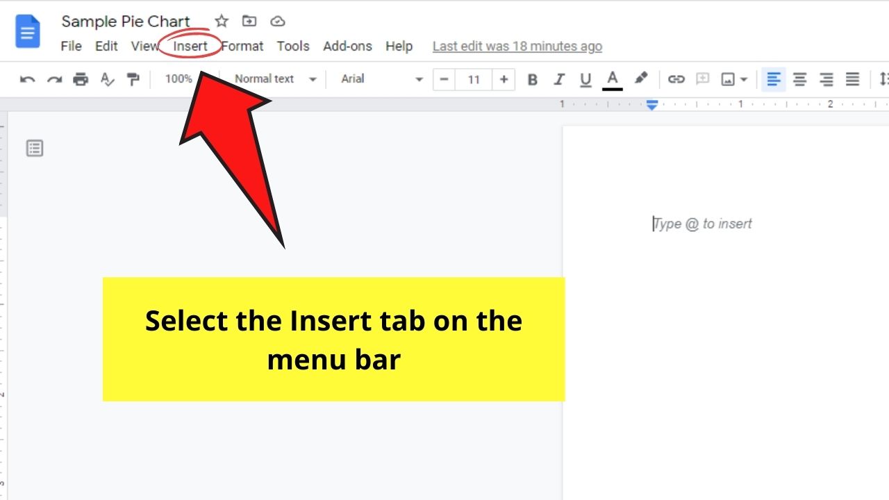
Step 1: In the Google Docs file you opened, head to the menu bar and select the Insert tab.
Step 2: In the dropdown that appears after clicking Insert, select the Chart button.
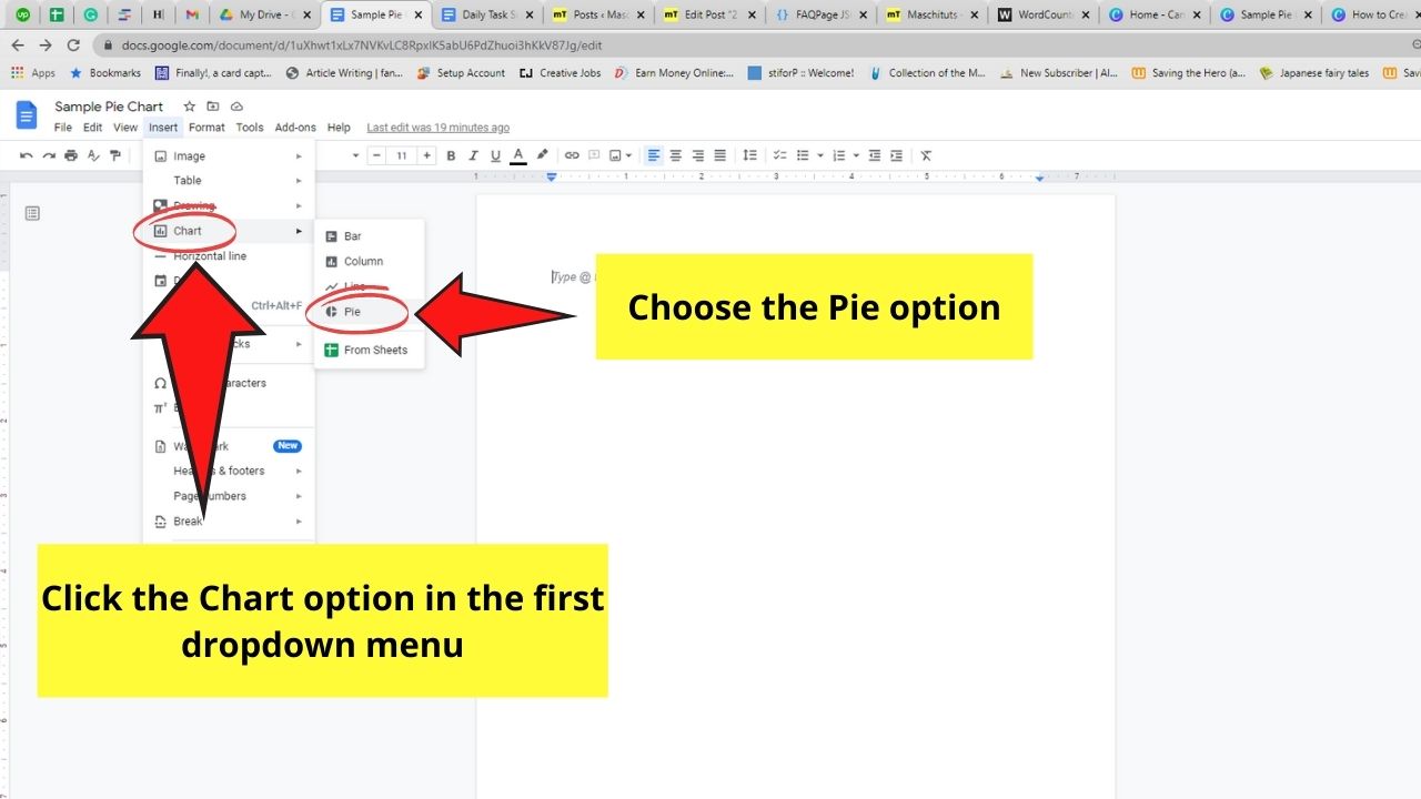
This will then open another dropdown menu showing you the various charts you can create in Google Docs.
Select the Pie option.
Step 3: Once you click the Pie button, a sample pie chart will then appear on the document.
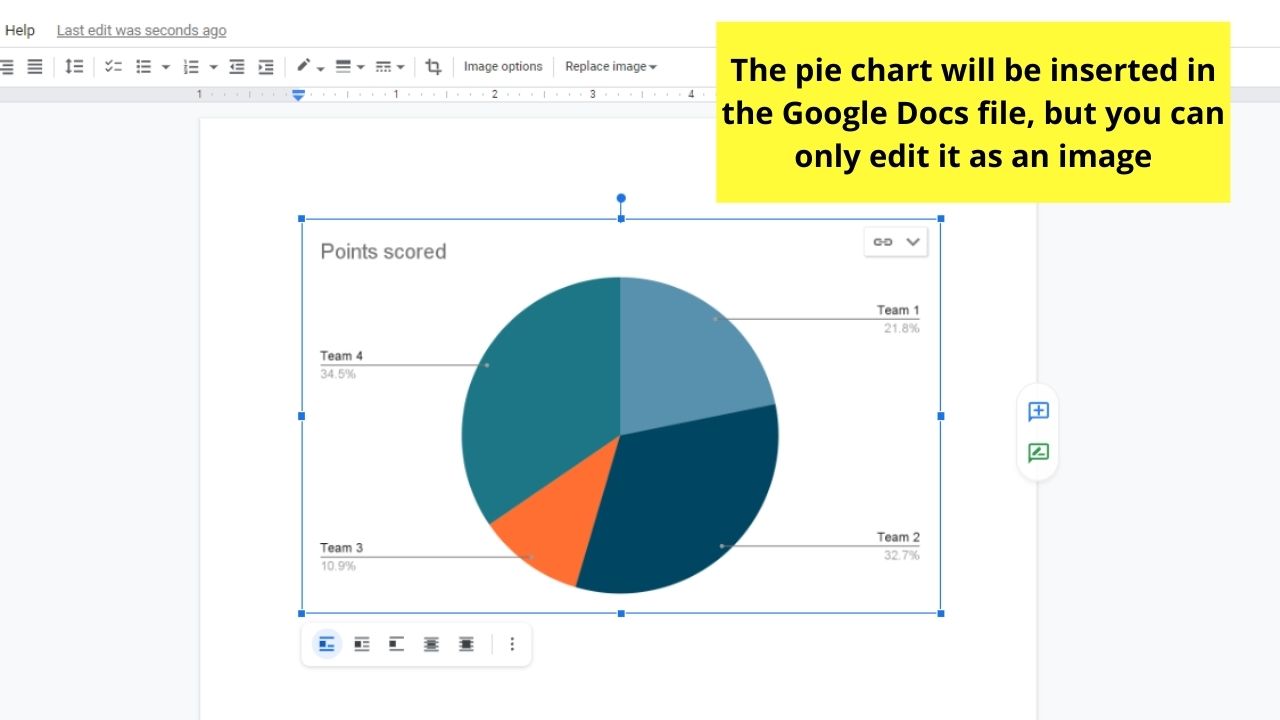
But, one thing you’ll notice with the pie chart is that you can’t directly edit it in Google Docs alone.
But, you definitely can change the data in Google Sheets (as they’re both part of the G Suite).
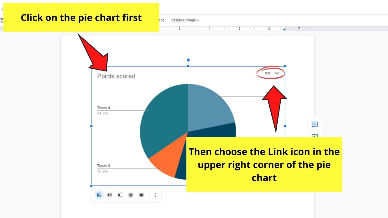
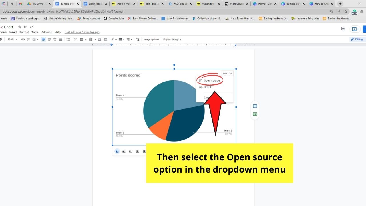
Step 4: To begin editing the data presented in the pie chart, click on it first. You’ll then see a link icon in the chart’s upper right corner.
Select the “v” icon. This will then open a dropdown menu. Choose the Open source option.
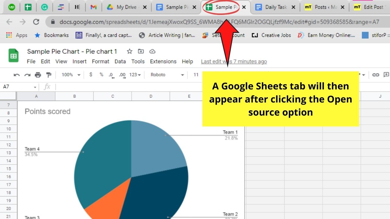
Step 5: After clicking the Open source button, a Google Sheets spreadsheet will appear in a new tab.
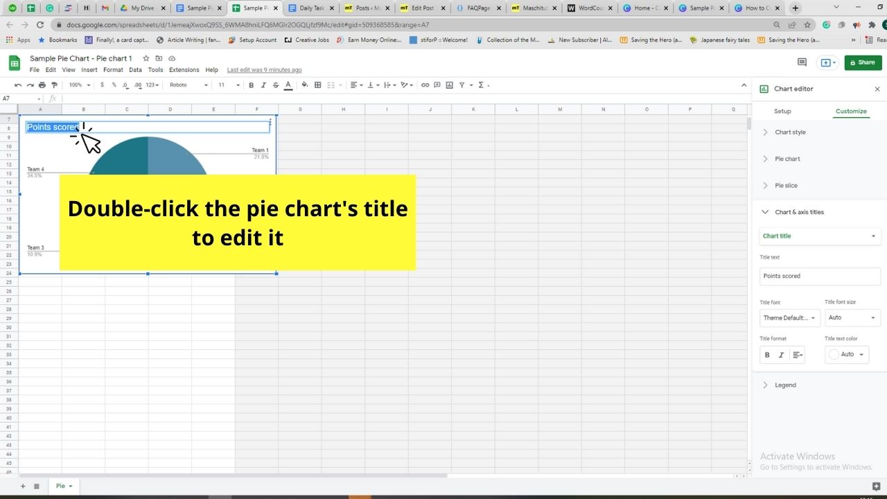
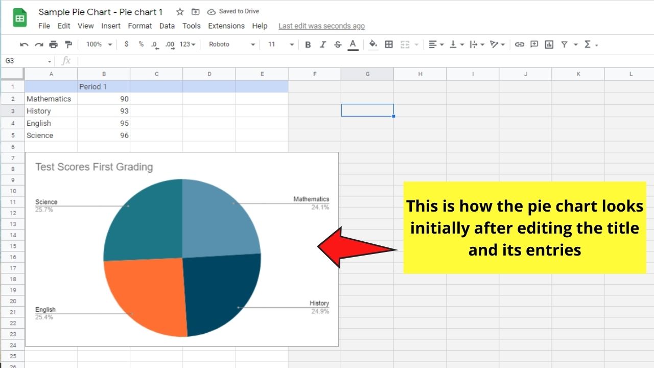
You can now begin editing the data of the pie chart, beginning with its title.
To proceed, just double-click the chart’s title and encode the title you want it to have.
As for the pie chart’s data, head to the table you’ll find above and enter the new values and labels accordingly.
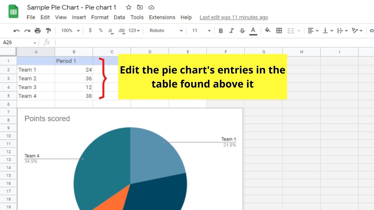
Every new data and label you encode will automatically reflect in the pie chart.
Step 6: To make your pie chart more presentable, you can customize its look.
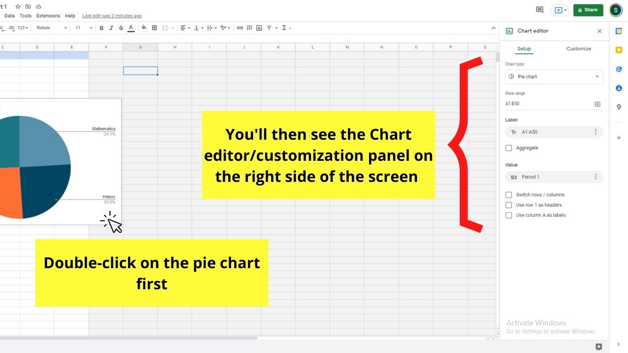
But, you first need to double-click on the pie chart to activate the customization window on the right side of the spreadsheet.
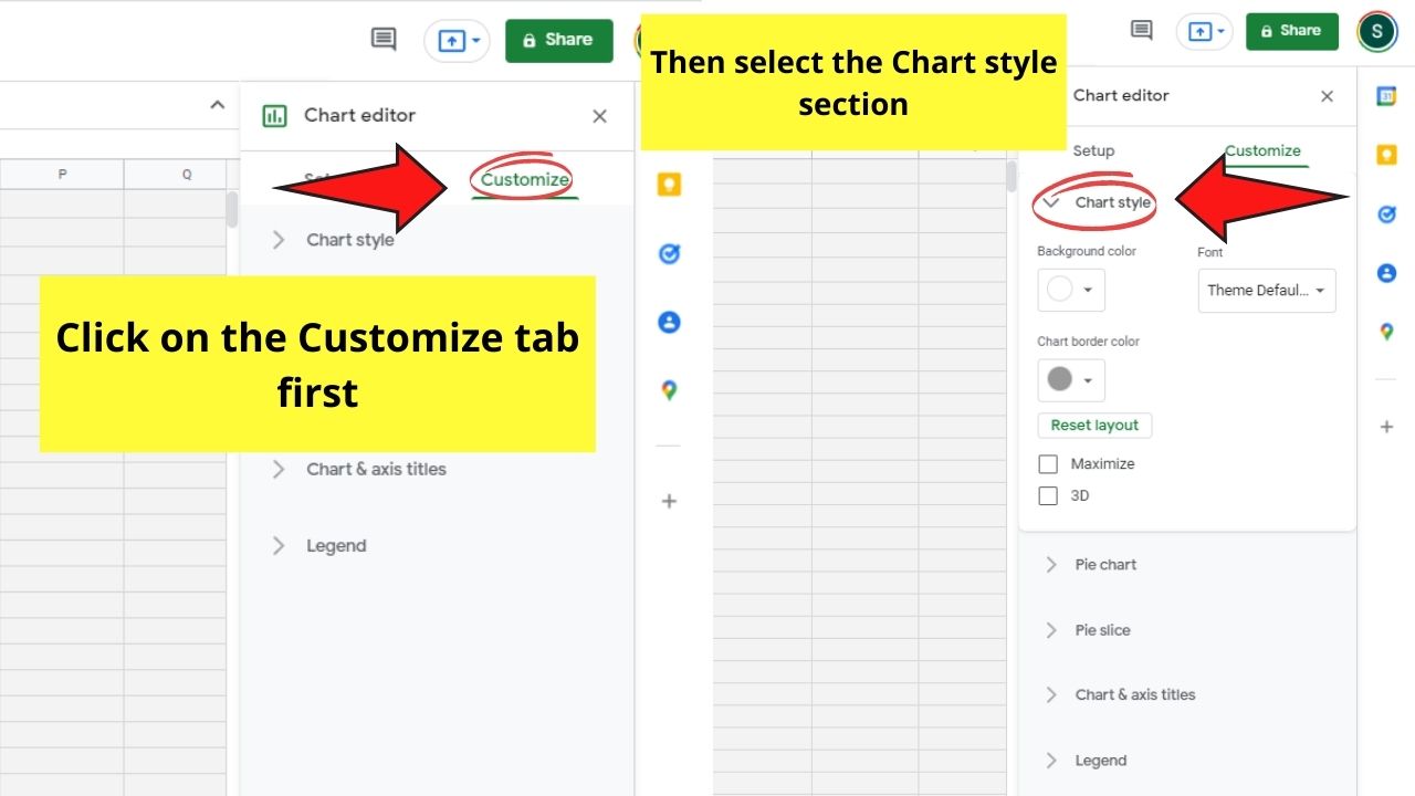
Hence, you should customize the pie chart’s look after editing the title.
After activating the Chart editor or customization window, click the Customize tab before selecting the “Chart style” section.
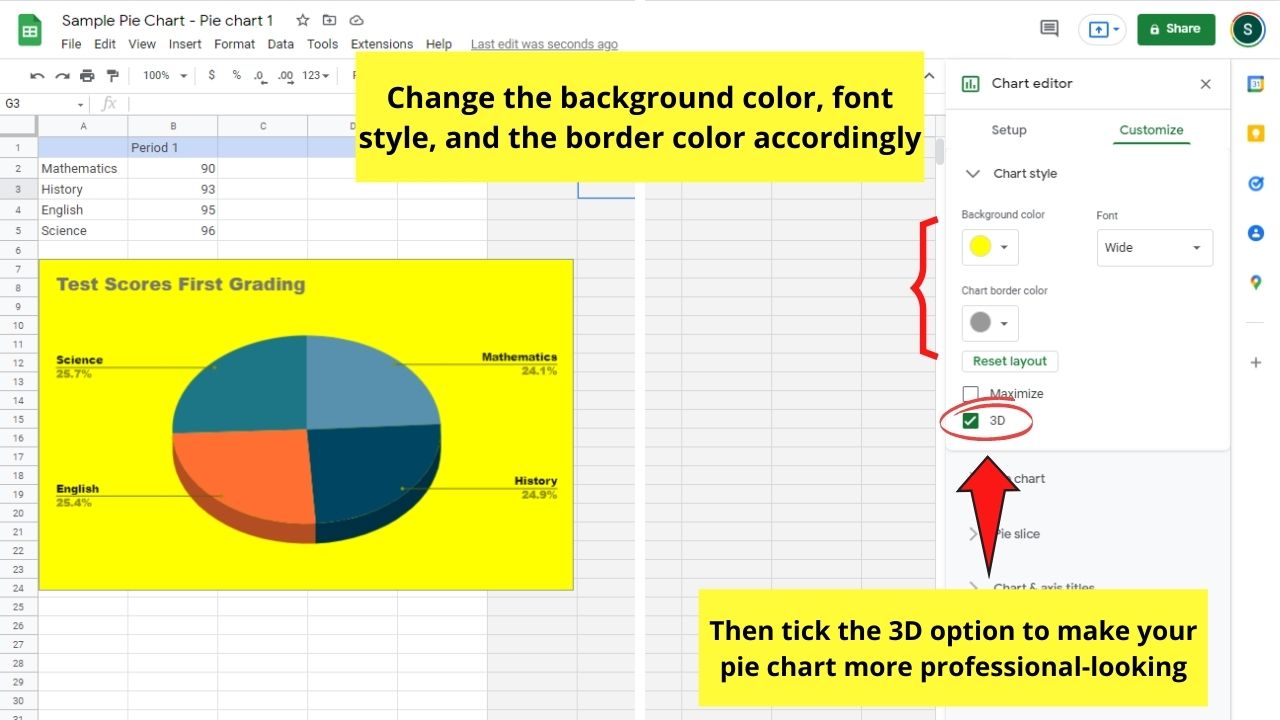
You can now select a new background color, as well as the Font style used and the chart’s border color.
You can even tick the 3D box for a more professional look for the chart.
Step 7: But, if you want to change the slices’ colors, you’ll need to double-click on a particular slice first.
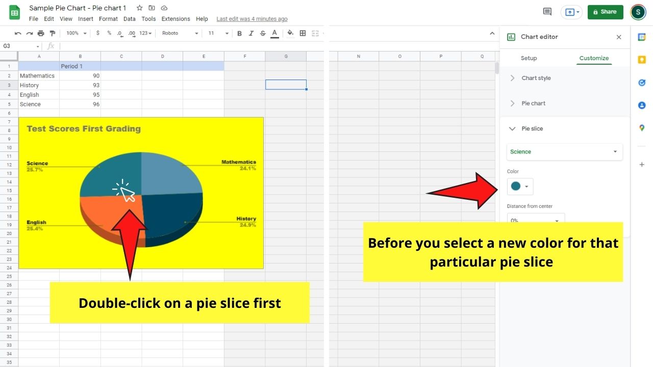
After that, head to the Pie slice section and select what color you want that particular slice to have.
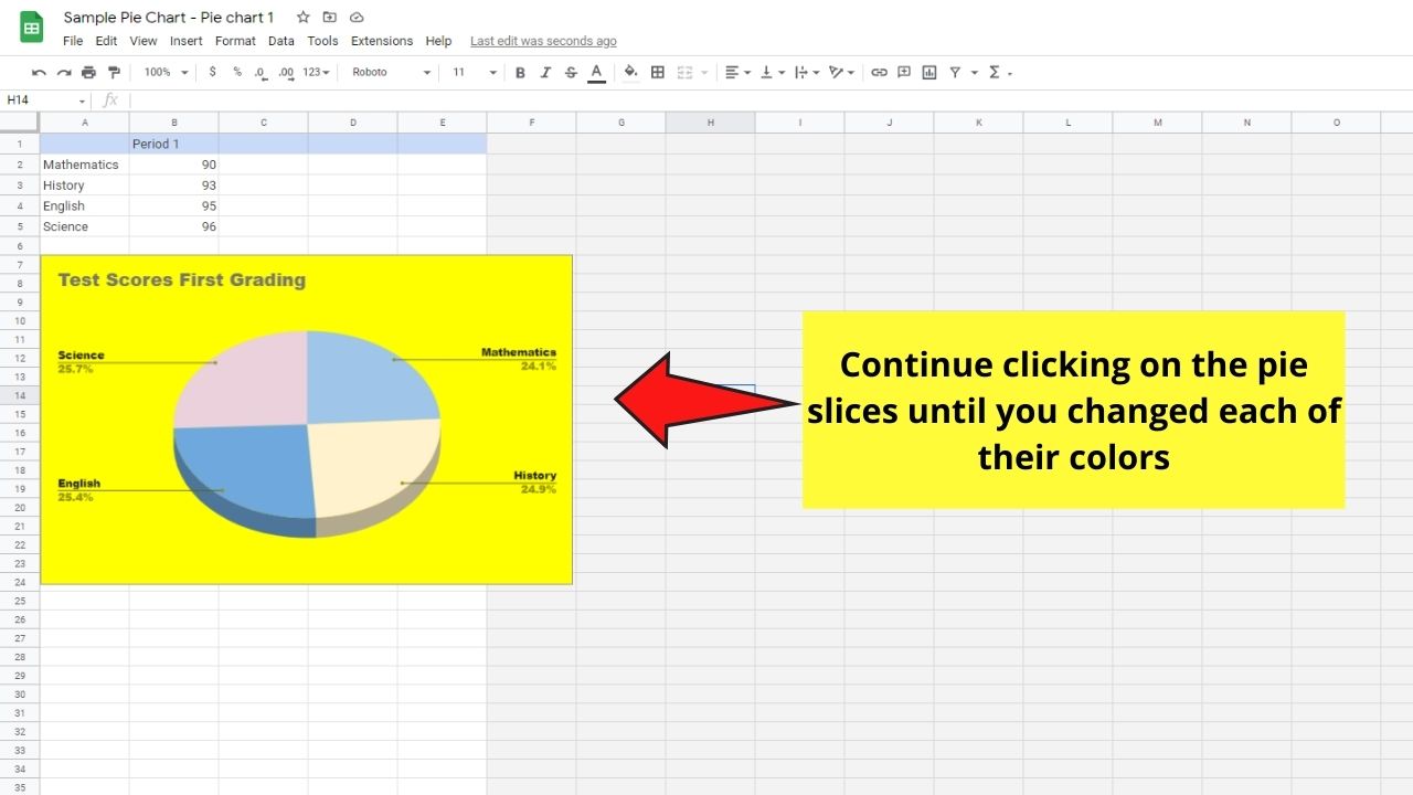
Continue with this step until you’ve changed all the pie slices’ colors accordingly.
Step 8: Once you are happy with how the pie chart looks, head to the Pie chart section and click it.
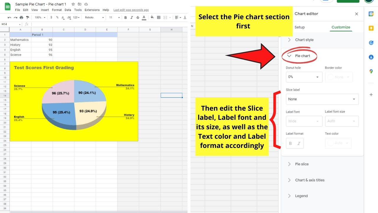
You’ll then be able to place values inside of the pie slices rather than making them appear outside it by default.
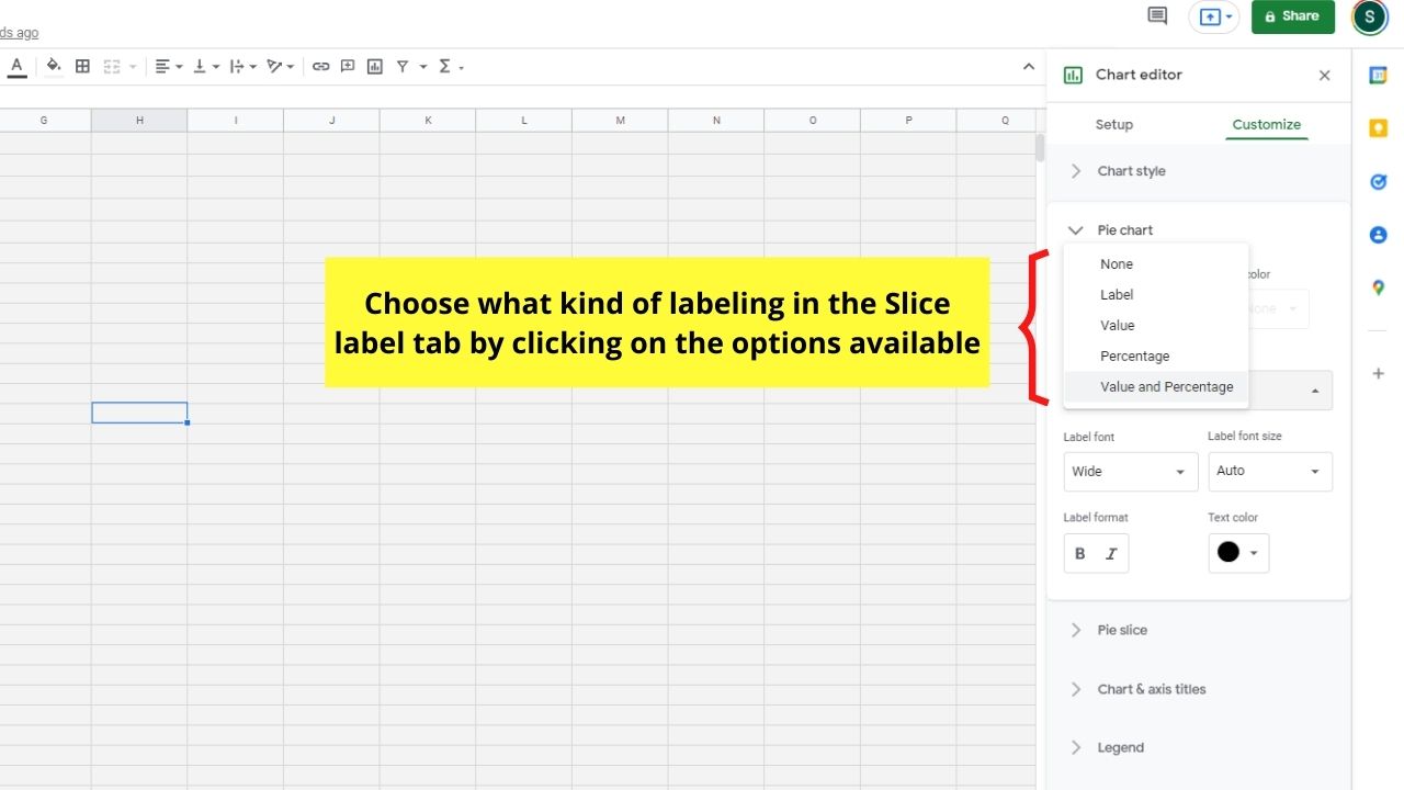
To do this step, head to the Slice label section and select what kind of labeling you want to have inside the pie slices.
You can even change the text’s color to make it more visible.
Step 9: If you want to change the labeling position, head to the Legend section in the customization window.
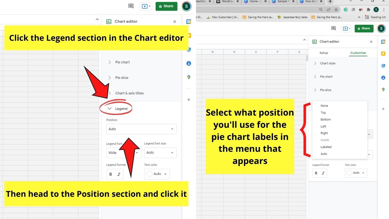
Then click Customize before choosing what location the labels will assume in the dropdown menu that appears.
Step 10: After editing the look and the data, head back to the Google Docs file you opened and select the Update button.
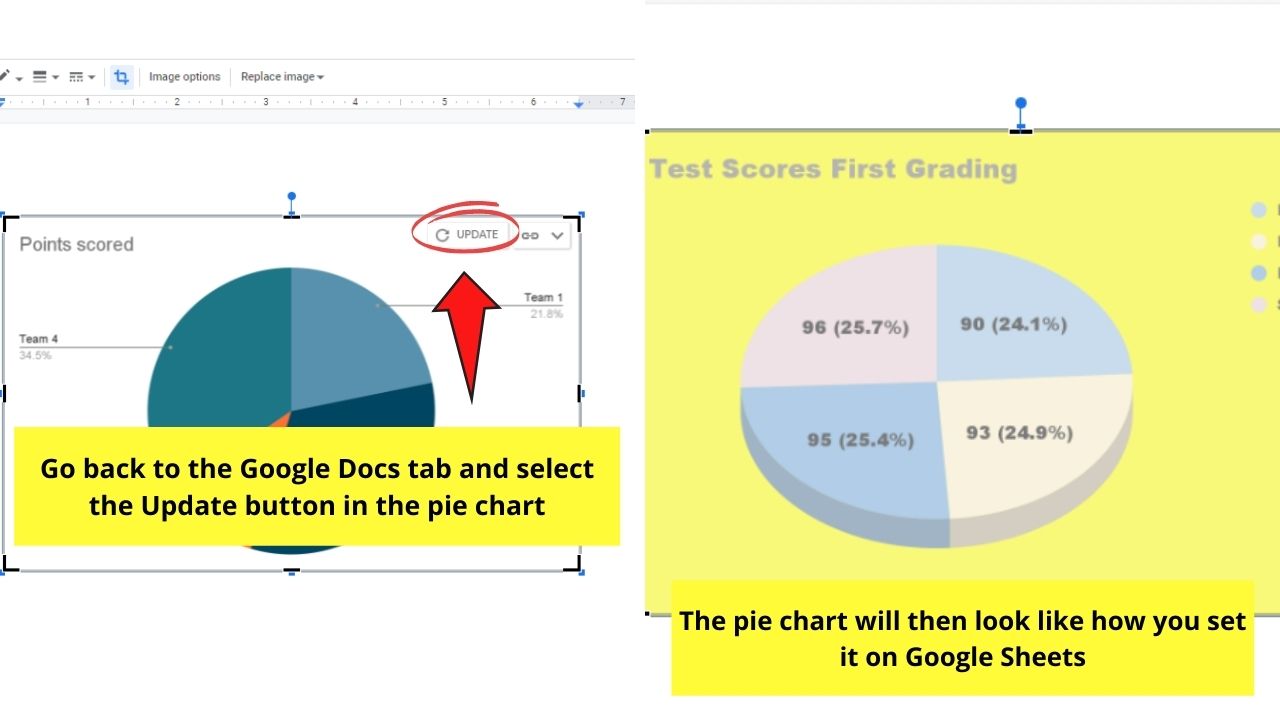
You can find this Update button in the same upper-right corner where you found the link icon earlier.
And with those ten steps, you’ve successfully created a pie chart in Google Docs.
But, if you prefer a simpler method of creating pie charts in this tool, there’s one workaround that I can show you.
3. How to Create a Pie Chart in Canva (and then Upload it to Google Docs)
To create a pie chart in Canva, follow these steps:
Step 1: Open a new file after logging in to your Canva account. You can click the Custom size button in the Create a Design button.
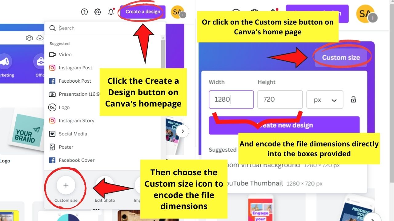
You can also select the “Custom size” button on Canva’s homepage.
Step 2: Once you’re on the editor page, head to the Elements tab and select the Charts section. You’ll then see the various chart types that you can create within the tool.
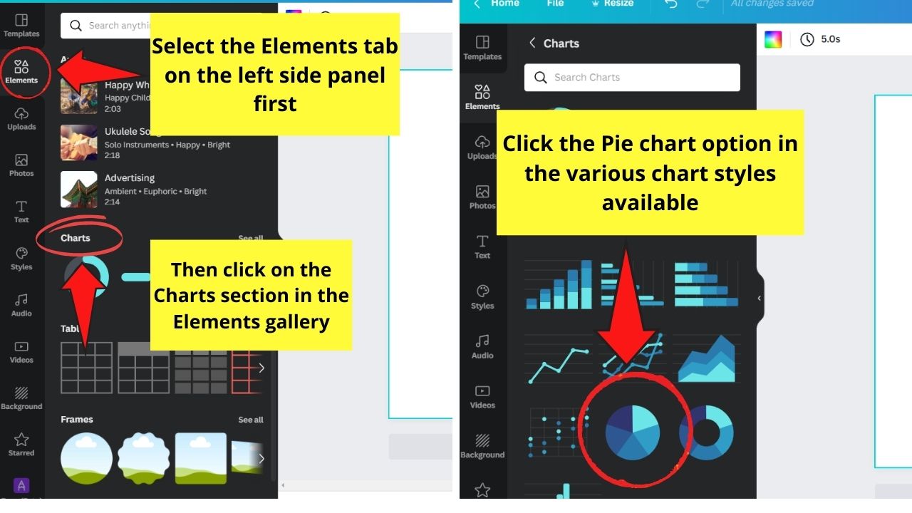
Since we’re creating a pie chart, select the pie chart option.
Step 3: After adding a pie chart in the canvas, head to the left side panel and edit the entries in the Data section.

You can also access your Google Sheets to use the data there directly. Head to the Add Data section and click the Google Sheets option to begin the process.
Step 4: Once you’re done entering the data, click the “Settings” tab.
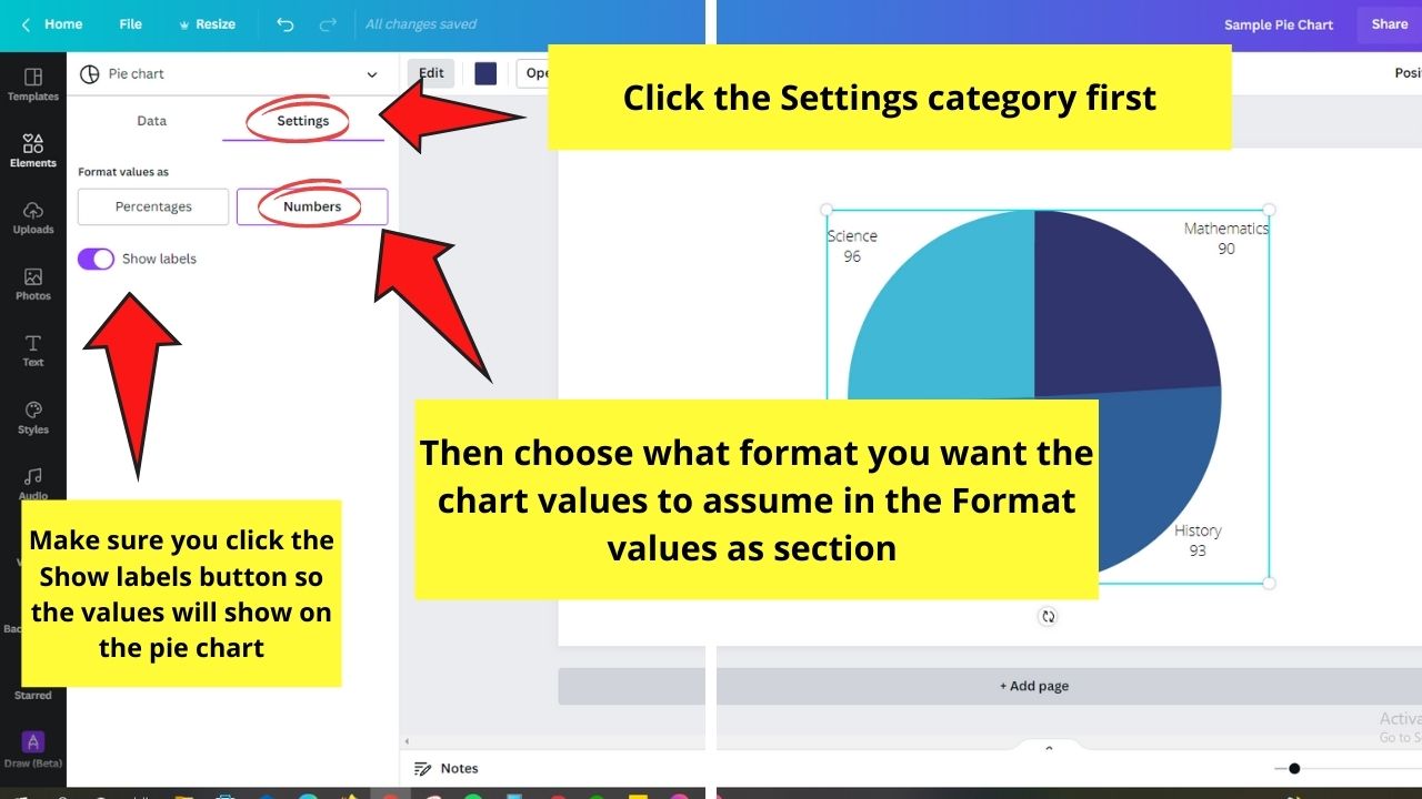
You can then choose to use Percentages or Numbers as the labeling for the pie slices.
Just make sure to click the Show labels button to make them appear on the pie chart.
Step 5: Edit the pie slices’ colors by clicking one part of the chart. Then, head to the color picker tile in the editor toolbar and choose what hue you’ll use.
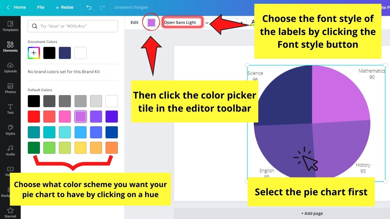
Then, change the font style of the labels by clicking the Font style button in the same editor toolbar.
Step 6: Once you’re satisfied with how your pie chart looks, click the Download button.
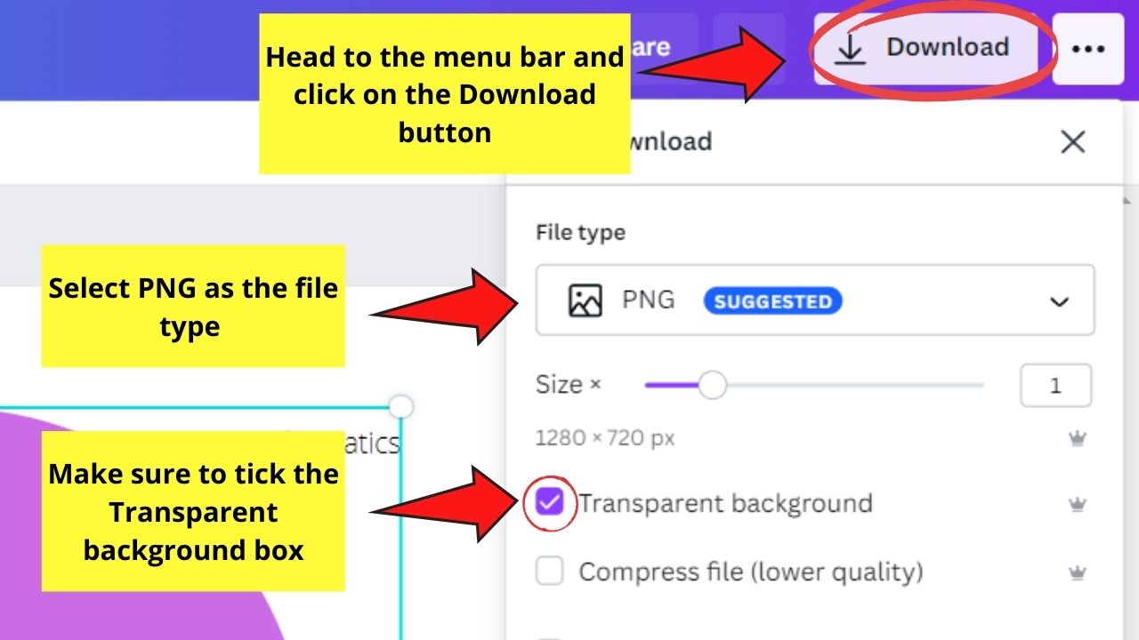
Make sure to select the PNG file type and tick the Transparent background option before saving the file on your device.
Step 7: Now that the Canva-created pie chart’s downloaded on your device, head back to Google Docs.
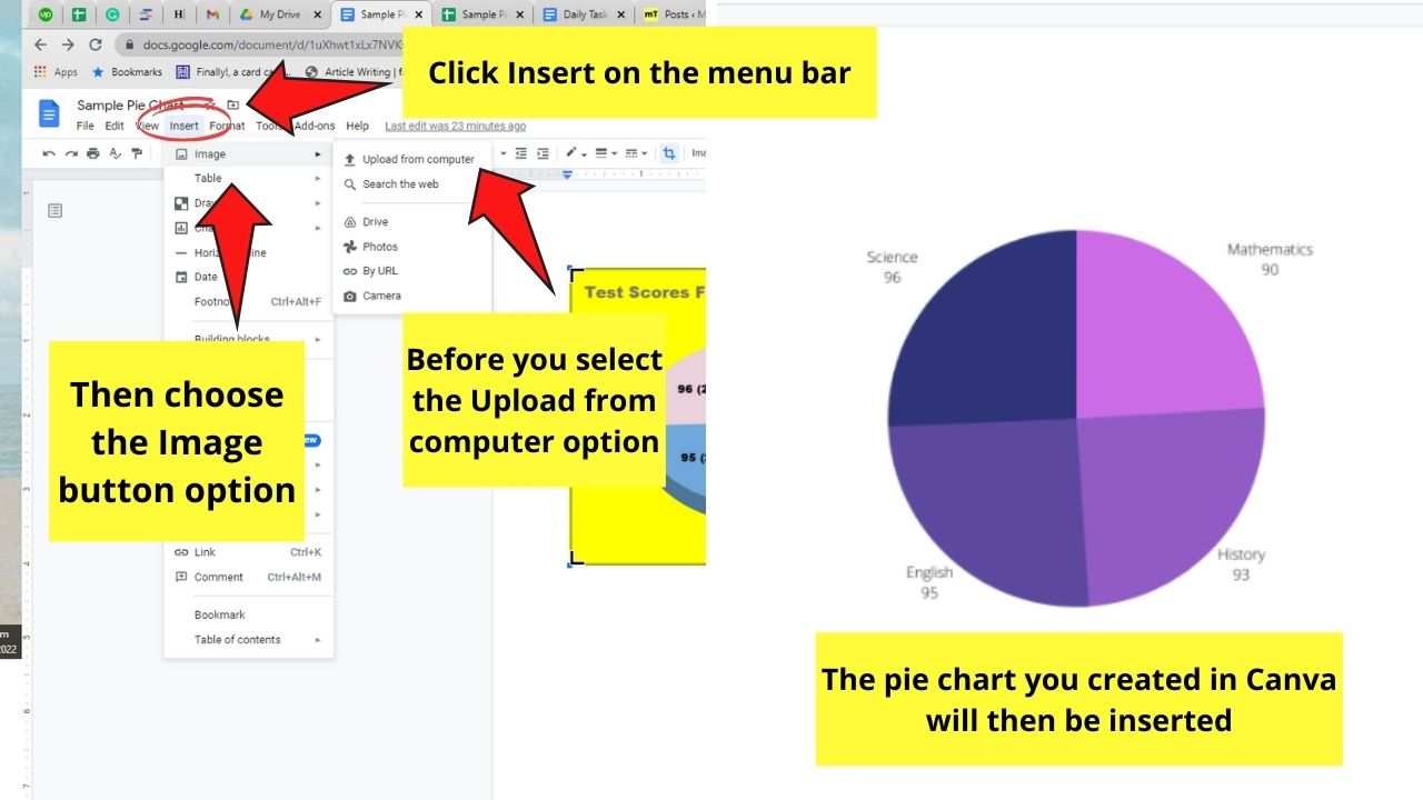
Then, select Insert on the menu bar. But, instead of selecting the Chart option, choose the Image button instead.
Select Upload from Computer and to locate the pie chart image you downloaded earlier. Click on the image file before choosing the Open button.
And, just like that, you’ve created a pie chart in Google Docs with the help of Canva.
Now that we’ve discovered the 2 methods of creating a pie chart in Google Docs, which of the two will you use for your Math assignment?
4. Frequently Asked Questions about How to Create a Pie Chart in Google Docs
Can I edit the data and labels of my pie chart using Google Docs only?
Though you can create a chart in Google Docs, all the editing work’s done in Google Sheets. You just click the link icon found on the upper right of the pie chart to open a spreadsheet. Then, double-click on the pie chart to activate the customization window.
What other kinds of charts can I create in Google Docs aside from pie charts?
In the dropdown menu that appears after selecting the Insert tab, you can opt to create a Bar graph, Column chart, and even a Line graph. Also, you can directly insert a chart you created in Google Sheets through the From Sheets option.
How do you create a donut chart using Google Docs?
If you prefer to use a donut chart for presenting category proportions, click the Chart option under Insert. Select Pie and click on the link icon to make the Chart editor window appear. Then, select Customize before heading to the Chart style button and changing the donut value to more than 0%.